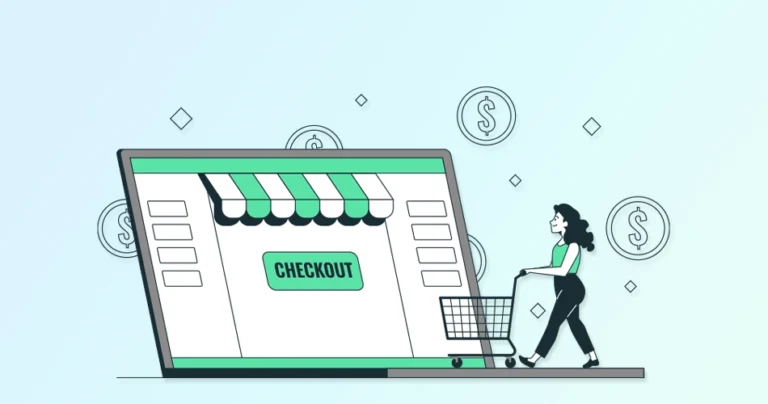
A customer arrives at your store, genuinely excited about a product they’ve just discovered. They check the details, love what they see, and confidently add it to their cart. At this point, they’re fully ready to buy — all that’s left is completing the checkout.
This is exactly where most users abandon the cart and eCommerce brands lose money — right at the last step.
- The checkout page looks cluttered
- The form fields feel endless
- The page loads slowly
- A surprise shipping fee pops up
And just like that — the customer closes the tab. This little moment of frustration costs you revenue. This is why optimizing your checkout experience isn’t optional. It directly affects your conversion rate, customer trust, and overall revenue. Even small improvements at checkout can lead to massive increases in sales.
If your goal is to understand where customers drop off and how to fix it, this guide gives you clear, practical steps you can implement immediately.
What is Checkout Abandonment?
Checkout abandonment happens when a shopper adds products to their cart, starts the checkout process, but exits before completing the purchase. In simpler words, the buyer journey stops at the last step.
The typical checkout abandonment flow looks like this:
- Interest: The customer adds items to their cart
- Intent: They click “Checkout” and begin filling in details
- Drop-Off: They leave the website without buying
This metric helps you understand:
- Where customers are getting stuck
- Why aren’t they completing payments
- Which parts of the checkout need improvement
Even small issues can create big losses when thousands of users go through your checkout every week.
Why Do Customers Abandon Checkout?
Let’s take a deeper look at why customers abandon their carts — and what’s going through their minds.
1. Unexpected or Hidden Costs
Nothing frustrates customers more than seeing an unexpected fee at the last step.
Examples:
- Additional service charges
- Shipping charges added at the end
- Extra handling fees
- Taxes were not shown earlier
No shopper likes a last-minute shock, especially when it increases the final price.
2. A Complicated Checkout Process
Your checkout should feel simple and fast. Long steps and unnecessary requirements only create friction.
Common issues:
- Too many form fields
- Multi-step checkout with no progress indicator
- Forced account creation
- Asking for unrelated information
So the shorter and cleaner your checkout flow is, the higher your completion rates. If checkout feels like filling out a government form, they leave.
3. Slow or Broken Website
Even a delay of 2–3 seconds can reduce conversions dramatically.
Problems include:
- Slow-loading checkout pages
- Payment errors
- Crashes
- Elements are not loading properly on mobile
- Validation errors are not showing
When technology doesn’t work, trust instantly disappears.
4. Lack of Trust or Security Signals
Customers hesitate to share their card details unless they feel safe.
Red flags include:
- No SSL (https://)
- Missing trust badges
- No customer service information
- No return or refund policy
- Poor user interface
A checkout page must feel credible, secure, and professional.
5. Limited Payment Options
Not everyone pays the same way. When customers don’t see their preferred option, they simply walk away.
Some prefer:
- Apple Pay
- Google Pay
- PayPal
- Credit cards
- BNPL (Buy Now, Pay Later) like Klarna or Afterpay
- UPI (India)
- Direct bank transfers
If your store doesn’t support these, you lose customers.
11 eCommerce Checkout Best Practices (Detailed Guide)
These practices are tested, proven, and used by leading brands to increase conversions.
1. Offer One-Click Checkout
One-click checkout is one of the most powerful conversion-boosting tools in e-commerce.
It allows returning customers to:
- Skip entering shipping details
- Skip adding billing information
- Skip entering card details
Their saved information completes the order instantly with just one tap.
Why it works:
- Less friction = faster purchases
- Customers feel more confident buying
- Perfect for impulse purchases
- Reduces drop-offs during form entry
How to implement effectively:
- Keep signup simple
- Allow customers to securely save addresses
- Integrate Apple Pay, Google Pay, Shop Pay, etc.
- Use address and card autofill
Outcome: This alone can significantly reduce friction and increase conversions — especially among mobile shoppers.
2. Include a Guest Checkout Option
Many customers don’t want to create an account — especially first-time buyers.
Forcing them to register creates unnecessary friction and pushes them away.
Benefits of Guest Checkout:
- Removes barriers
- Makes checkout faster
- Reduces drop-offs
- Builds trust by respecting user preferences
Best practices:
- Show guest checkout prominently
- Keep it equally smooth as a normal checkout
- Allow customers to create an account after purchase
- Avoid forcing email verification during checkout
This simple step alone can drastically reduce abandonment.
3. Optimize Checkout for Mobile Devices
Mobile users make up 60–75% of online shoppers today. But mobile screens are small — and buyers get frustrated easily. A seamless mobile checkout is essential.
How to optimize mobile checkout:
- Adapt the checkout to fit any screen size.
- Avoid clutter and distractions by focusing on key elements like product summary, form fields, and the “Buy Now” button.
- Reduce the number of form fields and use autofill features.
- Compress images and keep your code clean and efficient to avoid unnecessary delays.
- Use large, easy-to-tap buttons with clear labels like “Proceed to Checkout” or “Pay Now”.
- Present all checkout steps on a single, scrollable page
Scrolling is easier than clicking multiple small buttons on mobile. When mobile checkout is smooth, your conversion rate increases automatically.
4. Don’t Ask for Unnecessary Information
Every unnecessary field creates friction. Every additional step increases drop-offs.
Only ask for essential information:
- Contact Information: Name, email address, and phone number (for delivery updates).
- Shipping Address: Where to send the order.
- Billing Address: If different from the shipping address.
- Payment Information: Credit card details, digital wallet information, etc.
Avoid asking for:
- Unrelated Questions: Avoid asking for information that’s not directly relevant to the purchase, such as date of birth or gender.
- Duplicate Requests: Don’t ask for the same information twice (e.g., asking for billing address when it’s the same as the shipping address).
Shoppers want speed — not interrogation.
5. Display Clear Product Information in Checkout
This practice is all about giving your customers a final reassuring nod before they seal the deal. It’s a simple yet powerful way to reduce uncertainty, build confidence, and ultimately, increase conversions.
Customers can see a clear summary of their chosen products and ensure they haven’t made a mistake. That means no second-guessing and fewer chances of returns.
Showing product details helps customers confirm:
- They selected the right product
- The correct size, color, and quantity
- The final price
- Discounts applied
What to show:
- High-quality thumbnail images
- Name & variant
- Price per item
- Total order amount
- Shipping charges
- Taxes
- Discounts
This prevents confusion, reduces returns, and improves checkout confidence.
6. Add a Progress Indicator
A progress indicator shows customers how many steps are left.
Examples:
- Step 1: Shipping
- Step 2: Billing
- Step 3: Payment
- Step 4: Confirm
Why it works:
- Encourages completion
- Sets clear expectations
- Reduces anxiety
- Helps customers feel in control
Tips:
- Keep it simple
- Place it at the top
- Use clear labels
- Maintain consistency across devices
Shoppers love knowing where they are in the process.
7. Offer Multiple Payment Methods
Offering multiple payment gateways and methods ensures that no matter how your customers prefer to pay, you can accommodate them. This flexibility is key to reducing friction at checkout, improving the customer experience, and ultimately, boosting your conversion rates.
If someone walks into your brick-and-mortar store with cash, but you only accept credit cards, you’ve just lost a sale. The same principle applies to your online store.
Here’s all you need to offer:
- Credit/Debit Cards: Visa, Mastercard, American Express, Discover.
- Digital Wallets: Apple Pay, Google Pay, Samsung Pay, and PayPal.
- Buy Now, Pay Later (BNPL): Services like Klarna, Affirm, and Afterpay.
- Bank Transfers: Direct bank transfers or ACH payments.
Other than these, while still niche, accepting Bitcoin or other cryptocurrencies can cater to a tech-savvy audience. All in all, try to create a more inclusive and convenient checkout experience for your customers, meaning more chances of conversions.
8. Be Transparent About All Costs
Customers hate surprise costs — and that’s one of the top reasons they abandon checkout.
Show costs clearly:
- Shipping fees
- Taxes
- Service charges
- Duties and import fees (if international)
Tips for transparency:
- Show shipping calculator on product page
- Display tax calculation details
- Avoid hidden fees
- Offer free shipping above a minimum order value
Transparency builds trust and eliminates disappointment.
9. Use Upsells and Cross-Sells (Smartly)
Upselling and cross-selling can increase your revenue without hurting user experience.
Examples:
- “You might also like…”
- “Bundle and save 10%”
- “Upgrade to a bigger size.”
- “Add accessories for best results.”
Best practices:
- Keep recommendations relevant
- Limit the number of suggestions
- Don’t block checkout flow
- Use clean visuals
- Offer incentives (like small discounts)
When done right, upsells increase Average Order Value (AOV) while improving customer satisfaction.
10. Enable Address Autofill
Typing a full address can be annoying — especially on mobile. Autofill speeds up checkout and reduces errors.
How to implement:
- Enable browser autofill
- Integrate Google Places API for address suggestions
- Allow multiple saved addresses
- Ensure autofill works smoothly on mobile
This simple feature can significantly reduce checkout time.
11. Display Trust Signals Throughout the Checkout
Customers want to feel safe. If your checkout doesn’t look secure, they won’t enter their payment details.
Important trust signals to display:
- SSL certificate (https://)
- Secure checkout badges
- Payment provider logos
- Trust seals like Better Business Bureau (BBB), TrustPilot, TRUSTe, or Norton
- Clear return policy
- Customer support information
Why it matters:
- Builds instant credibility
- Reduces fear of fraud
- Increases conversions
- Improves brand trust
A secure-looking checkout makes buyers feel confident.
If you need help implementing these best practices for checkout on your eStore, get our e-commerce development services. We’ll help increase sales and revenue for your eCommerce business.
Conclusion: A Smooth Checkout = Higher Conversions
If it’s fast, simple, transparent, and trustworthy — customers complete their purchase.
If not — they abandon it.
Here’s a quick recap of the best practices:
- One-click checkout
- Guest checkout
- Mobile optimization
- Minimal form fields
- Clear product info
- Progress indicators
- Multiple payment modes
- Transparent pricing
- Smart upsells
- Autofill support
- Trust signals
If you want help implementing these improvements for your eCommerce store, our team can optimize your checkout experience to boost conversions and revenue.
Even a 10–20% improvement in checkout completion can translate into lakhs of additional monthly revenue for growing eCommerce brands. Want faster conversions and fewer drop-offs? Our e-commerce experts can optimize your checkout flow from end to end. Get a free consultation today.
FAQs on eCommerce Checkout Best Practices
Q1. What is checkout abandonment in e-commerce?
Checkout abandonment refers to shoppers exiting the checkout before completing payment. It shows that shoppers had buying intent but encountered friction, confusion, or unexpected issues that stopped them from finalizing the order.
Q2. How can I reduce checkout abandonment on my e-commerce website?
You can reduce checkout abandonment by offering guest checkout, enabling one-click checkout, simplifying form fields, optimizing mobile checkout, showing clear product details, offering multiple payment options, and displaying trust badges. Improving speed and transparency also helps significantly.
Q3. How does one-click checkout improve conversions?
One-click checkout saves customer details securely and lets returning users buy instantly. By removing repetitive steps and form fields, it reduces friction and encourages faster decisions, leading to higher conversion rates and better customer retention.
Q4. What information should I avoid asking during checkout?
Avoid asking for unnecessary details like date of birth, gender, company name (unless needed), or duplicate address fields. Only collect essential information required to complete the order—extra questions increase friction and cause drop-offs.
Q5. How many steps should my checkout process have?
Ideally, a one-page checkout works best for simplicity. But if you must use multiple steps, include a clear progress indicator (e.g., Shipping → Payment → Review) to guide users and reduce anxiety.
Q6. Does the checkout page speed really affect conversions?
Yes—significantly. A delay of even 2–3 seconds can drastically reduce conversions. Fast-loading checkout pages improve user experience, reduce frustration, and build trust with shoppers.
Q7. How can autofill help improve the checkout experience?
Autofill reduces typing effort, especially on mobile. It automatically fills in addresses, names, contact details, and payment information, helping customers complete checkout faster with fewer errors. This leads to higher completion rates.