When a visitor lands on your online store, they decide whether to stay or leave on the site, within seconds. That is, unless they have visited the store especially for a particular product.
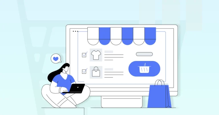
The homepage acts as your digital storefront. Its clarity, visual appeal, and strategic organization will directly impact the conversions and brand trust. A well-designed homepage balances aesthetics, usability, and conversion-driven elements. The aim is to guide shoppers seamlessly from discovery to purchase.
From intuitive navigation to persuasive visuals, every detail matters. So this blog will take you through the top eCommerce homepage design tips to boost conversions and enhance UX. Let’s begin.
Key Elements of a Good eCommerce Homepage Design
A high-quality eCommerce homepage does more than look good–—it builds trust, guides decisions, and drives sales. The best designs follow a strategic balance of clarity, speed, and persuasive elements to keep visitors engaged.
Clear Value Proposition
Your homepage has seconds to answer one critical question: Why should customers choose you? A strong value proposition cuts through the noise with concise messaging.
You need to highlight the discounts, free shipping, or unique selling points. Use bold headlines, benefit-driven copy, and supporting visuals to instantly communicate what sets your brand apart.
Intuitive Navigation
A confused visitor is a lost sale. Streamline navigation with a clean menu, logical categories, and a search bar that anticipates user intent. Dropdown menus, breadcrumbs, and sticky headers help shoppers find products effortlessly.
The easier it is to browse, the longer they stay—and the more likely they are to convert.
Strategic Call-to-Action (CTA)
A weak CTA is a missed opportunity. High-converting CTAs use action-driven language (“Shop Now,” “Get 20% Off”) and stand out with contrasting colors. Place them above the fold, near high-interest content, and limit choice overload.
You need to guide users toward one primary action at a time.
Trust Signals
Shoppers hesitate without proof of credibility. Reinforce trust with customer reviews, security badges, payment logos, and guarantees (e.g., “Free Returns”). Displaying trust signals near CTAs can reduce cart abandonment.
When buyers feel secure, they’re more likely to complete a purchase.
Mobile Optimization
Over half of eCommerce traffic comes from mobile—yet many sites still frustrate users with tiny buttons and slow load times. A mobile-friendly homepage needs thumb-friendly navigation, responsive images, and fast performance.
Google prioritizes mobile-first indexing, so lagging here hurts both UX and SEO.
Visual Hierarchy
Guide eyes where they matter most. Use size, color, and spacing to prioritize key elements: hero banners for promotions, product grids for bestsellers, and CTAs that pop. A well-structured layout ensures visitors see what you want them to see—without feeling overwhelmed.
Personalization
Generic homepages miss engagement opportunities. Dynamic content—like location-based offers, recently viewed items, or “Recommended for You” sections—makes shoppers feel understood.
Tools like AI-driven product recommendations can boost conversions by tailoring the experience in real time.
Fast Load Speed
Every second of delay costs conversions. Compress images, leverage browser caching, and minimize redirects to keep load times under 2-3 seconds. Speed isn’t just a ranking factor—it’s a make-or-break element for keeping impatient shoppers engaged.
Each of these elements plays a critical role in turning casual browsers into loyal customers. So hire Ecommerce web developers with us and have these elements incorporated on your eStore homepage. We’ll help optimize them consistently, so your homepage becomes a conversion powerhouse.
Top eCommerce Homepage Design Tips & Practices
Your homepage is the digital storefront of your online business—it needs to captivate, guide, and convert visitors within seconds. A well-optimized eCommerce homepage blends aesthetics with functionality. That ensures navigation while driving sales.
Create a Product-focused Hero Section
The hero section is prime homepage real estate. Feature high-quality visuals of your best-selling or seasonal product with a clear CTA. A compelling hero image with minimal text grabs attention instantly and sets the tone for the shopping experience.
What to Do?
- Use high-quality images or videos of your best-selling/most appealing product.
- Keep text minimal—highlight only the key benefit or offer.
- Include a strong, action-driven CTA (e.g., “Shop Now” or “Get 50% Off”).
- Ensure the hero section loads quickly and is mobile-responsive.
- Test different hero banners (A/B test) to see which performs best.
Show Clear Value Proposition
Tell visitors why they should buy from you in seconds. Highlight free shipping, discounts, or unique benefits upfront. A strong value proposition builds trust and reduces bounce rates.
What to Do?
- State your unique selling point (USP) in a short, bold headline.
- Support it with a brief subheading or bullet points if needed.
- Place it above the fold—visitors should see it immediately.
- Use icons or visuals to reinforce trust (e.g., free shipping, easy returns).
- Avoid jargon—keep messaging simple and customer-focused.
Include Primary Call-to-Actions (CTAs)
Strong CTAs guide users toward conversion. Use action-driven phrases like “Shop Now” or “Get 50% Off” in contrasting colors. Place them strategically to maximize clicks.
What to Do?
- Use contrasting colors to make CTAs stand out.
- Keep CTA text action-oriented (“Buy Now,” “Claim Offer”).
- Place primary CTAs near high-value content (hero section, product grids).
- Limit choices—one main CTA per section to avoid decision fatigue.
- Test different CTA placements and wording for better conversions.
Show Highly-recommended Products First
Display bestsellers or trending items first—social proof drives sales. Customers trust popular choices, increasing the likelihood of a purchase.
What to Do?
- Display bestsellers, top-rated, or trending products at the top.
- Use labels like “Customer Favorites” or “Bestsellers” to build trust.
- Include quick-view options or “Add to Cart” buttons for faster decisions.
- Update this section regularly based on sales data.
- Ensure mobile users can easily scroll and tap these products.
Feature the New Arrivals & Seasonal Items
Fresh inventory excites shoppers. Highlight new or seasonal products to create urgency and keep your store looking updated.
What to Do?
- Create a dedicated “New Arrivals” section near the top.
- Use urgency cues like “Just Launched” or “Limited Stock.”
- Rotate seasonal items (e.g., holiday collections) for relevance.
- Link these products to related categories for easy exploration.
- Highlight exclusivity (e.g., “Only Available Here”).
Highlight the Offers Clearly
Discounts and deals should be unmissable. Use bold banners, countdown timers, or badges to draw attention and boost conversions.
What to Do?
- Use bold, eye-catching banners for discounts (e.g., “50% Off Today Only”).
- Place offers near the top or in sticky headers for visibility.
- Add countdown timers for time-sensitive deals.
- Ensure promo codes (if any) are easy to apply at checkout.
- Avoid overwhelming users—keep offers relevant and uncluttered.
Add a Competent Search Box With Autocomplete
A smart search bar speeds up product discovery. Autocomplete and filters help users find what they need faster, improving UX.
What to Do?
- Place the search bar prominently (top center or top right).
- Enable autocomplete with product suggestions.
- Include filters (e.g., by category, price) in search results.
- Optimize for typos and synonyms (e.g., “sneakers” vs. “running shoes”).
- Track search queries to identify popular/unavailable products.
Add Social Proof Elements
Customer reviews, ratings, and testimonials build credibility. Display them prominently to reassure hesitant buyers and increase trust.
What to Do?
- Show customer reviews/ratings on product thumbnails.
- Display trust badges (e.g., “10,000+ Happy Customers”).
- Feature testimonials or user-generated content (UGC).
- Highlight press mentions or influencer endorsements if applicable.
- Keep social proof near CTAs to reduce hesitation.
Create Well-structured Navigation Menu
Simplify browsing with a clean, organized menu. Use dropdowns for categories and ensure mobile responsiveness for seamless navigation.
What to Do?
- Use clear, concise category names (e.g., “Men’s Shoes,” not “Footwear”).
- Limit top-level menu items to 5-7 for simplicity.
- Include dropdowns for subcategories (e.g., “Running → Trail Shoes”).
- Add a “Sale” or “Deals” link for bargain hunters.
- Test menu usability on mobile (hamburger menu should be easy to use).
Prioritize Clarity Over Creativity
Aesthetic design matters, but usability comes first. Prioritize clean layouts, readable fonts, and straightforward messaging. Confusing designs drive users away—clarity keeps them shopping.
What to Do?
- Avoid overly artistic designs that confuse users.
- Use readable fonts (sans-serif for web) and sufficient contrast.
- Keep product images clean with white backgrounds when possible.
- Ensure buttons look clickable (shadows, rounded corners).
- Follow conventional eCommerce layouts for familiarity.
Build FOMO (Fear Of Missing Out)
Scarcity drives action. Use phrases like “Limited Stock” or “Selling Fast” to create urgency. Countdown timers for flash sales also push hesitant buyers to act quickly.
What to Do?
- Show stock levels (“Only 3 Left!”) for high-demand items.
- Use countdown timers for flash sales.
- Highlight recent purchases (“20 bought in the last hour”).
- Offer limited-time discounts (“Ends Tonight”).
- Use urgency colors (red/orange) for low-stock warnings.
Show the Trust Factors
Security badges, payment logos, and return policies reassure shoppers. Display these near checkout buttons to reduce cart abandonment and build confidence in your brand.
What to Do?
- Display secure payment icons (Visa, PayPal, SSL badges).
- Mention return policies (“Free 30-Day Returns”).
- Show shipping info (“Free Delivery Over $50”).
- Add contact info (live chat, phone number) for reassurance.
- Feature certifications (e.g., “Eco-Friendly Certified”).
Optimize for a Mobile-first Experience
Most shopping happens on phones. Ensure fast load times, thumb-friendly buttons, and responsive design. A smooth mobile experience improves rankings and conversions.
What to Do?
- Use large, tappable buttons (minimum 48×48 pixels).
- Simplify forms (autofill, fewer fields).
- Compress images to reduce load times.
- Test on multiple devices (iOS, Android, different screens).
- Avoid pop-ups that block mobile navigation.
Prioritize Performance & Security
Slow or unsafe sites lose customers. Optimize images, enable HTTPS, and minimize plugins. Speed and security impact both user trust and SEO rankings.
What to Do?
- Optimize images (WebP format, lazy loading).
- Enable HTTPS and display security badges.
- Minimize redirects and unnecessary scripts.
- Use a fast, reliable hosting provider.
- Regularly test speed (Google PageSpeed Insights).
A homepage built with taking these practices into account will work hard to turn visitors into customers. So implement them carefully to boost engagement, improve UX, and drive more sales.
And for the most successful results with these practices, get our eCommerce website design services.
Let’s Wrap It Up
Your homepage is more than just a landing page. It’s like a digital handshake that welcomes visitors and sets the tone for their shopping experience. A well-designed homepage blends clarity, speed, and persuasion, guiding users seamlessly from discovery to purchase.
Remember, the best eCommerce homepages prioritize user needs over flashy design. Test, refine, and keep optimizing based on real data. That ensures your homepage stays aligned with customer expectations and industry trends. So, want to design and build the best eCommerce homepage? Then connect with us today!
FAQs on eCommerce Homepage Design Tips
Q1. How many CTAs should I include on the homepage?
Focus on one primary CTA (like “Shop Now”) above the fold, with secondary CTAs (e.g.,”Learn More”) placed strategically. Too many options can overwhelm users.
Q2. What’s the best way to display social proof on the homepage?
Show customer reviews, ratings, trust badges, or real-time purchase notifications near high-value sections (like product grids or CTAs) to build credibility quickly.
Q3. How can I improve mobile usability for my eCommerce homepage?
Use thumb-friendly buttons, compress images, simplify navigation (like a sticky menu). Also, ensure fast load times—Google prioritizes mobile-friendly sites in rankings.
Q4. How often should I update my homepage content?
Refresh seasonal promotions, new arrivals, and bestsellers regularly. Test different layouts and CTAs monthly to optimize for conversions.
Q5. What’s the best placement for the search bar?
Top-center or top-right, with autocomplete and filters. Ensure it’s visible on all devices—30% of eCommerce visitors use search immediately.