Let’s say potential customers are visiting your eStore, but leaving just seconds or minutes later without even exploring the offerings. They might be frustrated by slow loading, confusing navigation, or a cluttered checkout.
Poor user experience (UX) drives away a majority of the shoppers, costing businesses billions in lost sales. In eCommerce, seamless UX isn’t just nice to have; it’s a decisive factor in conversions, retention, and brand loyalty.
In this blog, we’ll discuss eCommerce UX best practices, from intuitive design to frictionless checkout flows. You’ll learn everything eCommerce experts implement to reduce bounce rates, boost engagement, and maximize revenue. Let’s begin.
What is eCommerce UX?
eCommerce UX (User Experience) refers to the overall interaction a customer has with an online store. That means everything from browsing products to completing a purchase. It encompasses design, navigation, page speed, checkout flow, and every element that shapes how users perceive and engage with a website.
A well-optimized UX removes friction, guides shoppers effortlessly, and builds trust, directly impacting conversions and customer loyalty. Poor UX, on the other hand, leads to cart abandonment and lost sales.
eCommerce UX determines whether a visitor becomes a customer or leaves for a competitor.
Key Elements of eCommerce UX
A seamless eCommerce user experience (UX) hinges on strategic design and functionality. They guide shoppers effortlessly toward purchase. Here are the core elements of eCommerce UX:
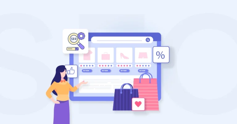
Intuitive Navigation & Search: Clear categorization and filters help users find products quickly. Predictive search with autocomplete further reduces friction by suggesting relevant results as users type, enhancing the overall shopping experience.
Mobile-first Design: Responsive layouts ensure smooth browsing on all devices. Thumb-friendly buttons and easy scrolling enhance usability.
Fast load times: Optimized images and minimal redirects prevent delays. Slow pages increase bounce rates—speed is critical.
High-Quality Product Pages: Crisp images, zoom functionality, and 360° views build trust. Concise yet compelling descriptions with clear pricing and availability.
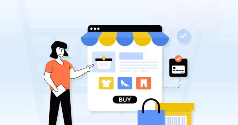
Simplified Checkout Flow: The Guest checkout option avoids forced account creation. Progress indicators and multiple payment methods reduce abandonment.
Personalization & Recommendations: AI-driven suggestions (e.g., “Frequently bought together”) boost average order value. Dynamic content based on browsing history improves engagement.
Accessible Customer Support: Live chat, FAQs, and easy return processes reduce post-purchase anxiety.
By taking care of these elements, you can create a frictionless shopping experience capable of converting visitors into loyal customers.
eCommerce UX Best Practices
A flawless user experience (UX) can make or break an online store. So here are data-backed best practices to enhance usability, boost conversions, and foster loyalty:
Simplify the Account Sign Up & Log In
Forced registrations kill conversions. A guest checkout option reduces friction, while social login shortcuts speed up access. The easier it is for users to start shopping, the lower your cart abandonment rate. Remember—every extra click is a chance for them to leave.
Overwhelming visuals and crowded layouts confuse visitors. A clean, focused homepage directs attention to key products and promotions. Prioritize clarity over chaos—shoppers should instantly understand your value proposition, not hunt for it.
What to Do?
Clear value proposition: Immediately convey what your store offers.
Strategic hero section: Highlight promotions or bestsellers.
If users can’t find products quickly, they’ll leave. Logical categories, predictive search, and smart filters streamline browsing. Intuitive navigation mimics in-store ease, helping shoppers discover what they need without frustration.
What to Do?
Mega menus for large catalogs: Organize subcategories clearly.
Breadcrumb trails: Help users track their path (e.g., Home > Men > Shoes).
Persistent search bar: Keep it visible on all pages.
Smart filtering: Allow sorting by price, ratings, popularity, etc.
Quick-loading dropdowns: Prevent lag in menu interactions.
Footer navigation: Include links to key pages (FAQ, Contact, Policies).
Consistent layout: Maintain uniform design across all pages.
Design the Product Page Strategically
High-quality images, detailed specs, and persuasive CTAs drive decisions. Missing details or poor visuals create doubt. A well-structured product page answers questions before they’re asked, reducing hesitation and boosting conversions.
What to Do?
High-resolution images & zoom: Show products from multiple angles.
Concise, scannable descriptions: Use bullet points for specs.
Prominent CTA buttons: “Add to Cart” should stand out.
Stock availability alerts: Show “Only 3 left!” to drive urgency.
User-generated content: Embed reviews, photos, and Q&A sections.
Related product suggestions: Cross-sell without distracting.
Make Landing Pages Conversion Funnels
Generic landing pages waste traffic. Tailor them to specific campaigns with clear CTAs, minimal distractions, and persuasive copy. A focused funnel guides visitors toward purchase, turning clicks into customers.
What to Do?
Single, clear goal: Align with the ad or promo driving traffic.
Strong headline & subheadline: Communicate value instantly.
Video or interactive demos: Show products in action.
Trust elements: Testimonials, badges, or media mentions.
Mobile-optimized forms: Short fields with auto-formatting.
A/B test variations: Optimize headlines, CTAs, and layouts.
Write User-centric Copies
Jargon-heavy or salesy text repels shoppers. Clear, benefit-driven copy speaks to customer needs. Whether it’s product descriptions or error messages, words should reassure, not confuse.
What to Do?
Address pain points: Focus on benefits, not just features.
Conversational tone: Avoid jargon; write like you’re helping a friend.
Scannable formatting: Short paragraphs, bullet points, bold keywords.
Action-oriented CTAs: Use verbs like “Get Yours Now” or “Start Saving.”
SEO optimization: Include keywords naturally for discoverability.
Localized language: Adapt to regional dialects/cultural nuances.
Optimize the Checkout Flow
Lengthy forms and hidden fees trigger abandonment. A one-page checkout with auto-fill, multiple payment options, and progress indicators keeps buyers moving. The smoother the process, the higher the completion rate.
What to Do?
Guest checkout option: No forced account creation.
Order summary visibility: Let users review items/prices before paying.
Post-purchase confirmation: Send email/SMS receipts with tracking info.
Focus on Mobile Commerce UX
Mobile shoppers demand speed and simplicity. Thumb-friendly buttons, swipe-friendly galleries, and fast load times prevent frustration. A laggy mobile experience means lost sales—optimize for smaller screens first.
What to Do?
Thumb-friendly design: Place CTAs within easy reach.
Accelerated Mobile Pages (AMP): Boost load speed.
Simplified forms: Use dropdowns and auto-formatting (e.g., for phone numbers).
Large, tappable buttons: Prevent misclicks.
Mobile-first visuals: Optimize image sizes for fast loading.
Instant answers prevent cart abandonment. Live chat resolves doubts in real-time, builds trust, and mimics in-store assistance. When customers feel supported, they’re more likely to buy.
What to Do?
Proactive triggers: Offer help after 30-60 seconds of inactivity.
Quick responses: Use chatbots for FAQs + human agents for complex issues.
Visible but non-intrusive: Minimize pop-ups during checkout.
Multilingual support: Cater to diverse customers.
Post-chat surveys: Gather feedback to improve service.
CRM integration: Save chat history for personalized follow-ups.
24/7 availability: Even automated replies improve trust.
Great eCommerce UX isn’t just about aesthetics—it’s about removing obstacles between browsing and buying. Each of these practices aligns with Google’s Core Web Vitals and HBR’s emphasis on user-centric design. So your eCommerce UX drives conversions while maintaining credibility.
To that end, you can hire our eCommerce website design to ensure your eStore UX drives conversions while maintaining credibility.
FAQs on eCommerce UX Best Practices
What’s the biggest mistake in eCommerce UX?
Overcomplicating navigation or checkout. If users can’t find products easily or face too many steps to purchase, they’ll leave. Simplicity = higher conversions.
Why is UX so important in eCommerce?
Good UX directly impacts conversions, customer retention, and brand loyalty. A seamless experience reduces bounce rates, cart abandonment, and frustration, leading to higher sales and repeat buyers.
How important are product images in eStores?
Critical. High-quality, zoomable images with multiple angles increase trust. Include lifestyle shots, size/comparison visuals, and videos for complex products.
What’s the role of speed in eCommerce UX?
53% of mobile users abandon sites that take >3 seconds to load. Optimize images, use lazy loading, and leverage caching. Test with tools like Google PageSpeed Insights.
Let’s Summarize
A seamless eCommerce UX isn’t just about aesthetics—it’s about removing friction at every step, from discovery to checkout. That involves simplifying navigation, optimizing for mobile, streamlining checkout, and building trust through smart design. That’s how you turn casual browsers into loyal customers.
Remember, small tweaks—like faster load times, clearer CTAs, or better product images—can dramatically boost conversions. Continuously test, gather feedback, and refine based on real user behavior.
As a Business Consultant at Brainspate, I collaborate with clients to understand their business objectives, challenges, and opportunities, and develop tailored strategies and action plans to drive organizational growth, increase efficiency, and enhance profitability.