Best Colors for eCommerce Websites: How to Choose the Right One?
Quick Summary
The best color for an eCommerce website is subjective and can vary depending on the target audience, brand image, and product offerings.
Studies have shown that blue and green are popular choices for eCommerce websites as they convey trust, security, and a sense of nature.
When choosing the best color for your eCommerce website, consider your target audience, brand personality, and the emotions you want to evoke.
Some of the common mistakes with colors are inconsistency with your brand palette, neglecting color accessibility for visually impaired users, creating an overwhelming color overload, etc.
Your eCommerce store’s color palette is its silent, first-response salesperson. It shapes a visitor’s perception and emotional response within the first milliseconds.
Far beyond the other aesthetic elements, including the theme and layout, color is critical. It’s a business tool grounded in consumer psychology and brand science. Using the best color strategically directly influences user trust, navigational ease, and ultimately, conversion rates.
So in this blog, we’ll explore the best colors for eCommerce websites and see the trends and combinations for the best results. Let’s begin with the basics.
What is Color Psychology?
Color psychology is the science of colors and hues and how they influence human emotions, perceptions, and behaviors. In eCommerce, this science goes beyond theory and shapes the customer experience in a practical manner.
Every person won’t be influenced by a single, specific color–their cultural background and personal experience will play a role. Using color strategically will help communicate the brand values and guide attention. It’ll also create an atmosphere that will encourage interaction.
For example, a brand trying to project eco-friendliness or sustainability would likely go for GREEN to evoke nature. On the other hand, a brand focusing on creating urgency during a sale would likely use RED for its attention-grabbing properties.
Why Color Psychology Matters for Online Stores
Rather than just a decorative one, choosing the right colors for your eCommerce store is a strategic business decision. Here are a few specific reasons for the same.
Builds Instant Recognition: Consistent colors increase brand recognition by up to 80%, making your store memorable.
Communicates Values: Colors telegraph your brand’s personality—blue for trust, green for wellness, yellow for optimism.
Guides User Attention: Strategic color accents can direct focus to call-to-action buttons, key features, and special offers.
Builds Trust: A harmonious and professional color scheme makes your site feel more credible and secure to new visitors.
Influences Perception: Colors can affect how users perceive your product’s quality, value, and even its size or weight.
Meets Audience Expectations: Luxury brands often use black, white, or gold to convey exclusivity, while eco-brands use earth tones to signal sustainability.
Ultimately, color psychology provides the foundational principles for making intentional design choices. It can subconsciously build trust, improve usability, and drive conversions on your website.
Scientific Impact of Color on eCommerce Conversions and Customer Behavior
Certainly, color design strategies come with some measurable criteria of user experience and conversion rate optimization. There are scientific notions like visual perception and neuromarketing, among others. They convey how color affects customer behavior at a subconscious level.
Beyond the design aesthetics, color choice is a quantifiable factor in UX (user experience) and CRO (conversion rate optimization). Scientific principles like visual perception, neuromarketing, and more explain how color directly influences customer behavior on a subconscious level.
Visual Hierarchy & Attention
The human eye is drawn to high-contrast elements. A strategic color strategy for something like an “Add to Cart” button is to make sure it never blends into the background. It can guide the users’ gaze and reduce cognitive load. That makes the path to purchase more intuitive.
Psychological Priming
Particular colors are known to cue emotional or behavioral responses. Blue, for example, is said to inspire feelings of trust and security. That’s why it’s common in the finance and tech arena. It subconsciously elevates a user’s comfort levels. That makes them more likely to complete a transaction.
The Von Restorff Effect
The Von Restorff Effect is the psychological principle of isolation. It says the more isolated something is by its contrasting background, the more likely it is to be remembered. So put an attention-grabbing accent color on your time-limited offers or best-selling products. They’ll become “isolated” and more salient. That directly impacts the purchase decision.
Reducing Perceived Effort
A clean, well-balanced color scheme with plenty of white space will be less mentally taxing. A cluttered or clashing color scheme creates visual noise and increases perceived effort. That leads to a higher bounce rate.
With proper scientific insights, a brand can move beyond guesswork and make well-informed, data-driven color decisions. It systematically removes friction and guides users toward conversion.
How to Choose the Best Color for eCommerce Websites?
Selecting the color palette for an eCommerce website balances brand identity, audience psychology, and functional design. Follow this strategic framework to make an informed decision.
Start With Your Brand Identity, Not Trends
Your color palette should feel like a genuine extension of your brand’s core personality. Start with laying out your key brand traits—are you reliable, innovative, or playful? Then select a dominant color based on that trait.
For example, if your brand sits on sustainability, then your palette is perhaps anchored around leafy greens.
Know Your Target Audience Demographics
Color perception is not universal; it is shaped by age, gender, culture, and personal experience. So research your primary demographic.
A palette that would resonate with a Gen Z audience would, therefore, be totally different from one targeting affluent professionals. Cultural contextualization of your audience avoids any gaffes and enables the colors to speak with them.
Analyze Your Competitive Landscape
Conduct a competitor analysis. Using a similar color scheme can help you fit within user expectations for your industry (e.g., blue for finance). However, employing a contrasting accent color can create a distinct visual identity and help your brand stand out in a crowded marketplace.
Prioritize Accessibility & Readability
A beautiful palette is useless if it creates friction. Maintain a high level of contrast between text and background colors. At a minimum, try to follow the Web Content Accessibility Guidelines (WCAG). This is not just inclusive design; it’s essential for usability. It prevents eye strain and is a way to cover the reading needs of all users, including yours.
Go for the 60-30-10 Rule for Balance
Use this classic interior design principle for a balanced layout:
60% Dominant Color: Your primary color, used for the background and large areas.
30% Secondary Color: A complementary color for menus, sections, and other key elements.
10% Accent Color: A vibrant, contrasting color reserved for call-to-action buttons (CTAs), links, and icons to guide the user’s eye.
Test & Iterate Relentlessly
Ultimately, data trumps opinion. Use A/B testing to validate your color choices, especially for critical CTAs like “Buy Now” or “Add to Cart.” A simple change in button color can have a significant, measurable impact on your conversion rate, providing concrete evidence for your final palette.
You need to choose the best color combination for an eCommerce website and incorporate it within your overall design and layout in the right way. For that, you can get our eCommerce website design services. We will analyze your business specifics and suggest the design imperatives, including the color palette, accordingly.
7 Trending Color Combinations for eCommerce Websites
Nowadays, the design trends have shifted from single colors to combination palettes. They are curated to evoke specific moods and align with contemporary design trends for competitive eStores.
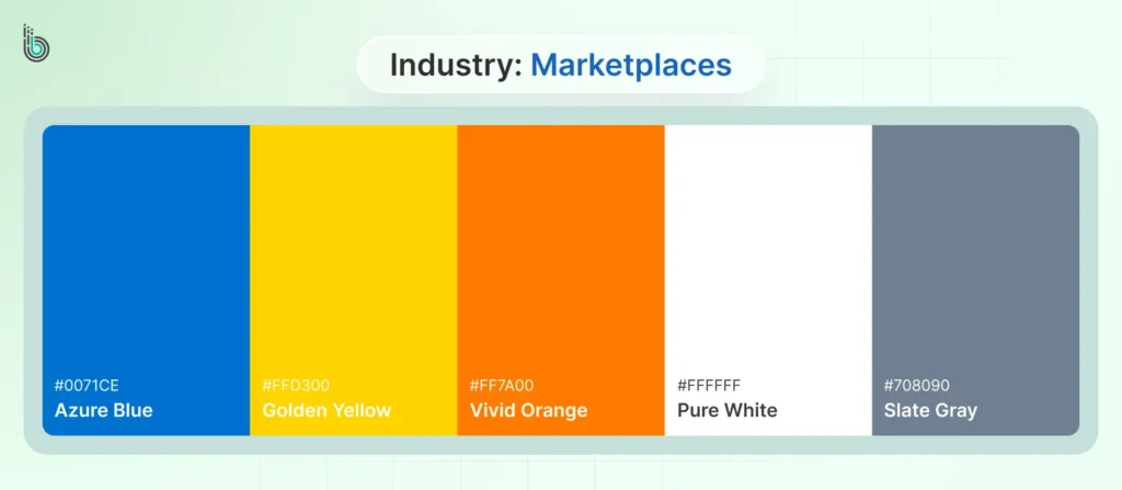
Electric Blue + Yellow + Orange + White + Slate
Industry: Marketplaces
This palette is engineered for energy and clarity. Electric Blue sets up the digital trust and reliability that are so crucial for a platform that hosts multiple vendors. The energetic Yellow and Orange serve as accent hues. They bring attention to offers, categories, and calls-to-action, thereby creating a sense of excitement and urgency.
White stands to provide a clean canvas, and Slate strikes a neutral, stable base for text and second-tier visual elements. That way, visual saturation can be avoided.
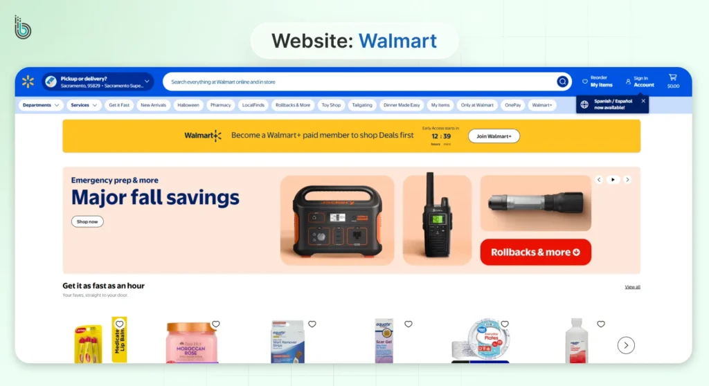
Top Examples: Amazon, Flipkart, Walmart.
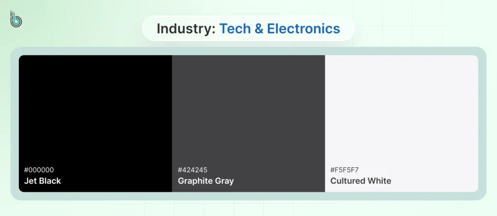
White + Black + Shades of Gray
Industry: Tech & Electronics
This is the quintessential palette for sophistication and innovation. It mirrors the aesthetic of the products themselves. White, therefore, sets a “clean room” ambience. It emphasizes the design and product features of an item without any distractions. Black stands for high-end status and power, while Shades of Gray build depth and create the feeling of precision engineering.
Together, all these evoke a modern, minimalist vibe with trustworthiness at the core.
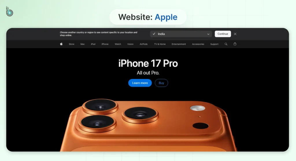
Top Examples: Apple, Google, Samsung.
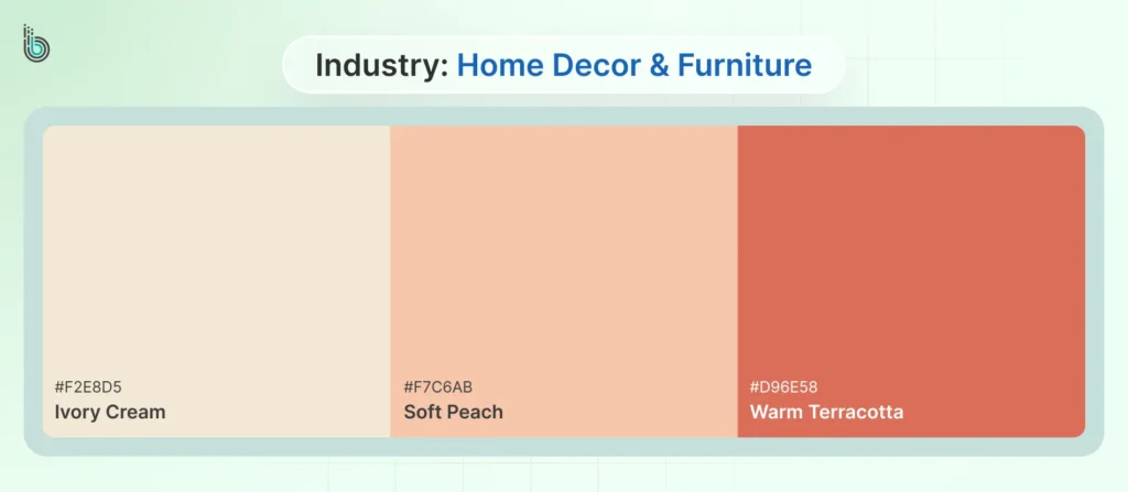
Cream + Peach + Terra Cotta (+ Neutral Green Tones)
Industry: Home Decor & Furniture
This palette feels warm, comfortable, and invitingly luxurious. Creams soften stark white in an organic way, feeling more like a space in use. Peach and Terra Cotta offer warmly earthen accents that feel crafted and welcoming. Then there is also the choice of Mocha Mousse, 2026 Pantone Color of the Year.
This palette subconsciously communicates coziness, sustainability, and tactile quality. It aligns perfectly with the desire to create a welcoming home.
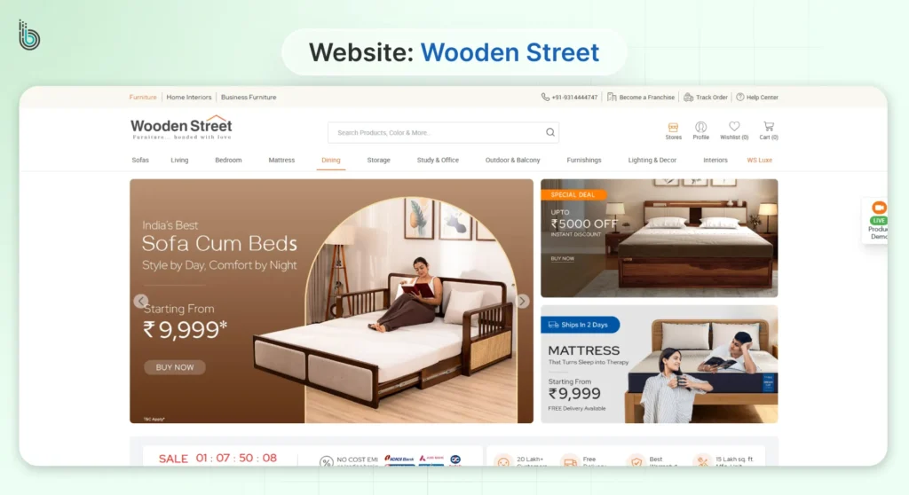
Top Examples: Wooden Street, Pottery Barn.
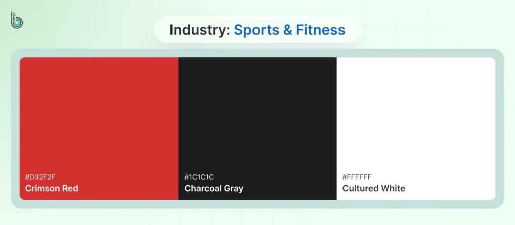
Black + White + Red
Industry: Sports & Fitness
The high-contrast, high-impact color scheme is based on the concepts of energy and performance. Black and White present an intense and pristine base similar to official uniforms and equipment. Red is a primal color that elevates heart rate and conveys urgency, passion, and action.
It’s perfect for “Buy Now” buttons, sale tags, and conveying a sense of power and determination. Red, of course, is optional for the palette.
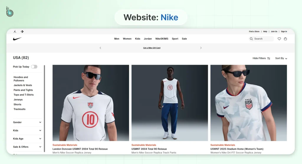
Top Examples: Adidas, Nike.
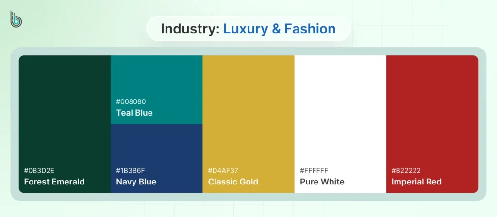
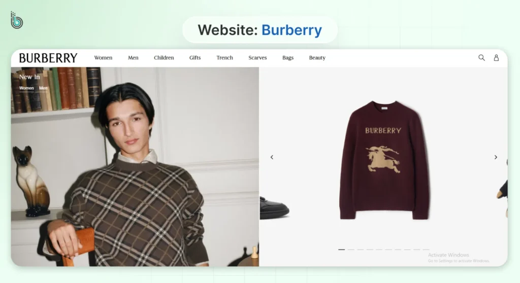
Forest Green + Navy Blue/Teal Blue + White + Gold + Red
Industry: Luxury & Fashion
This palette communicates heritage, reliability, and timeless elegance. This set spells heritage, dependability, and timeless style. Dark Forest Green and Navy Blue (or even Teal Blue) are deep, rich, and dignified-honour and defence of nature. They represent luxury and permanence.
Contrasting in pure brightness, White lends to the legibility and transparent finishing of the whole style. This combination remains free of transient trends, standing out instead as a symbol of classic yet worthy investment.
Top Examples: Gucci, Burberry.
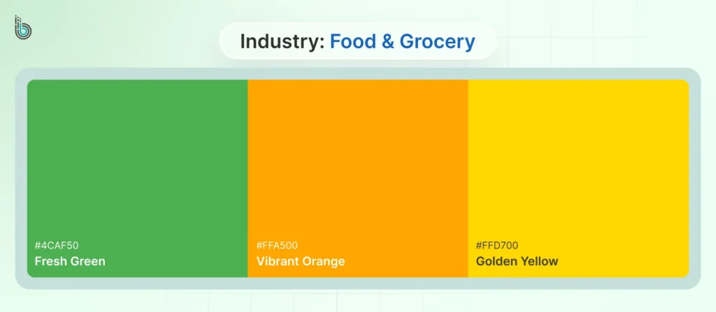
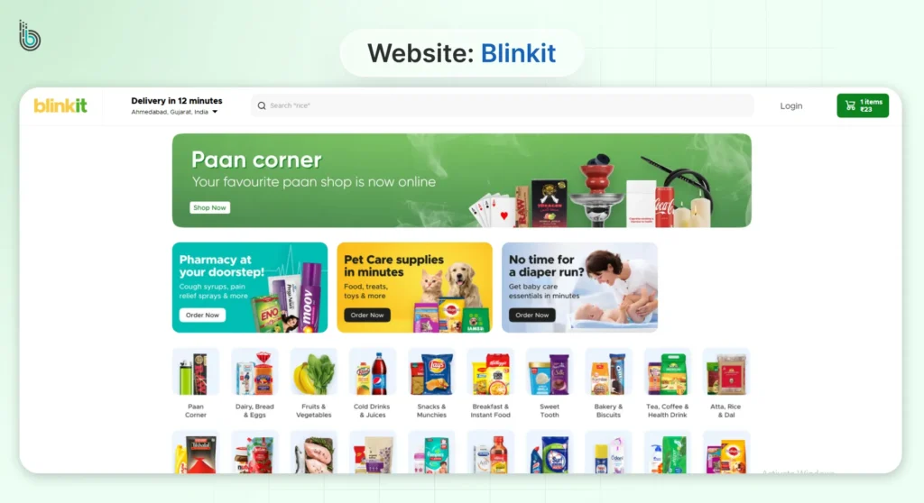
Orange + Yellow + Green
Industry: Food & Grocery
This palette directly taps into the psychology of fresh, ripe, and natural food. Orange and Yellow are vibrant colors that naturally stimulate the appetite, suggesting fresh, citrusy energy. Green asserts persistently that something is healthy, organic, and fresh. That is, mainly in the realm of produce and natural products.
Together, they create a bright and inviting environment that appears to be nourishing and wholesome.
Top Examples: BlinkIt, Amazon Fresh, Big Basket.
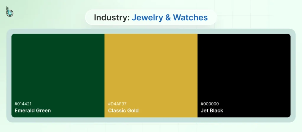
Gold + Black + Green
Industry: Jewelry & Watches
This combination is the epitome of opulence and prestige. Black provides a dramatic, gallery-like backdrop that makes products stand out. Gold directly represents wealth, luxury, and the material of many premium products. Green (often a deep emerald or forest) adds a final layer of richness, echoing precious gems and a sense of refined elegance.
It’s a palette that sells exclusivity.
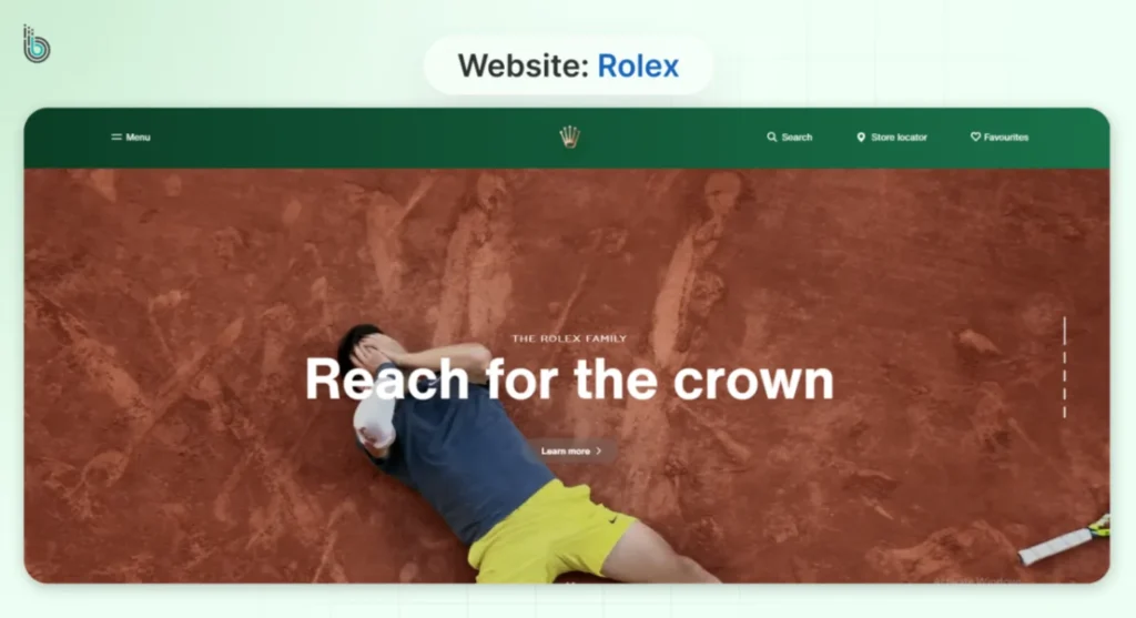
Top Examples: Timex, Rolex, Patek Philippe.
No matter your eCommerce niche, there are “right” color palettes for every store. You just need to apply the 60-30-10 rule to maintain balance. And always A/B test your primary accent color to drive the best results.
White vs Colored: Best Background Color for eCommerce Websites
Whether you are building an eStore or just a regular website, there’s a choice between white or colored backgrounds. It’ll be like a stage for your products and content.
White Background
A white background is the standard for a reason. It creates a clean, neutral canvas that puts the products at the forefront.
Pros
Product Focus: Eliminates visual competition, making product images the hero.
Perceived Trust & Size: Feels more spacious, professional, and is familiar to users, which builds trust.
Enhanced Readability: Offers the highest contrast for black text, ensuring easy reading.
Best for
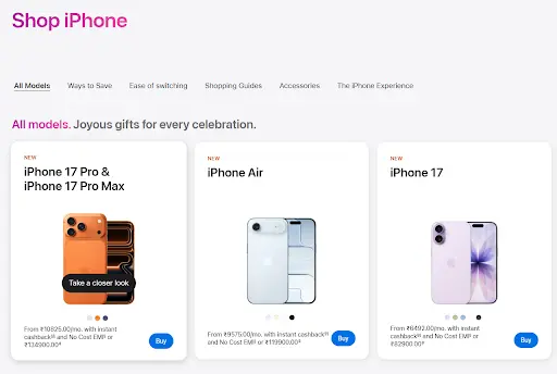
Stores with diverse product catalogs, luxury goods, and sites prioritizing a minimalist, content-first approach. For example, Apple.
Colored Background
A colored background is a powerful tool for immediate brand storytelling and mood creation.
Pros
Strong Brand Identity: Instantly immerses the user in a specific brand atmosphere (e.g., earthy green for wellness).
Memorability: A distinctive palette makes your store stand out from competitors.
Guided Focus: Can be used to frame specific content or create distinct sections.
Best for
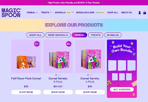
Bold, niche brands with a strong identity, single-product stores, or sites using color in specific, high-impact sections (like headers). For example, Magic Spoon.
How to Create the Perfect eCommerce Color Swatch or Style Guide?
You see, eCommerce websites tend to opt for different color schemes according to their business objectives as well as the type of interactions they expect on their website.
A successful color strategy for eCommerce requires consistency, which is only achievable with a formalized style guide. This document acts as your brand’s single source of truth. So every touchpoint—from your website to your marketing emails—feels unified and professional.
Step 1: Define Your Core Color Roles
Formally categorize your colors by their function:
Primary Brand Color (1-2 colors): The heart of your brand, used for your logo and key navigational elements.
Secondary Color (1-3 colors): Supports the primary palette, used for section backgrounds, secondary buttons, and accents.
Accent / CTA Color (1 color): A high-contrast color used exclusively for calls-to-action like “Add to Cart” or “Buy Now.” This should be your most visible color.
Neutral Colors: A range of grays, whites, and off-whites for backgrounds, body text, and borders.
Step 2: Document Technical Values for Digital & Print
For each color, specify its digital and print codes to guarantee accuracy across all media:
Hex Code: For web use (e.g., #2A5CAA).
RGB & HSL: For on-screen design (digital ads, social media).
CMYK: For physical packaging and print materials.
Pantone (PMS): For branded merchandise and premium print work.
Step 3: Establish Clear Usage Rules
Prevent misuse by defining clear “Do’s and Don’ts”:
Button Hierarchy: Specify which colors are for primary, secondary, and tertiary buttons.
Text Contrast: Mandate that text meets WCAG AA compliance (a contrast ratio of at least 4.5:1 for normal text) against its background.
Accent Color Limitations: State that the accent color should not be used for body text or large background areas to maintain its impact.
Proper codification is essential for building a color-consistent eCommerce brand that supports engagement and conversions, and ongoing eCommerce website maintenance company help ensure those standards are applied consistently across design updates and platform changes.
Color Accessibility and WCAG Compliance for Online Stores
For an eCommerce website, color accessibility is more than just a design practice. It’s a fundamental requirement for reaching the full market and mitigating legal risk.
Make sure you adhere to Web Content Accessibility Guidelines (WCAG). Then your site will be usable by people with visual impairments like color blindness, low vision, or age-related vision decline.
Here are the color-specific WCAG requirements:
Contrast Ratio: Text and its background must have a sufficient contrast ratio.
Standard Text (AA Level): At least 4.5:1
Large Text (AA Level): At least 3:1
Non-Text Contrast (UI Components): The visual focus indicator for interactive elements (like links and form fields) must have a 3:1 contrast ratio against adjacent colors.
Color as an Indicator: Links must be distinguishable by more than color alone (e.g., underlined). Form fields with errors should be identified with both color and text.
What you need to do is audit your palette, test form fields, review product variants, and check focus states. By prioritizing accessibility, you’ll do more than just avoid exclusion. You’ll create a cleaner, more usable experience for every customer. It directly supports your conversion goals.
Final Thoughts
Ultimately, the quest for the perfect eCommerce website color schemes is not about chasing a single trending hue. It is a strategic exercise in aligning color with your brand’s core identity and the psychological triggers of your target audience.
The most effective colors are those that build trust, guide the user journey with intuitive clarity, and consistently reinforce what you stand for. Let your eCommerce color palette be a deliberate and authentic expression of your brand’s value.
Choose colors that boost trust and sales in eCommerce. Get professional advice from a premier eCommerce website design company in India for a visually compelling site. Then connect with us today!
FAQs on Best Colors for eCommerce Websites
1. What is the single best color for an eCommerce website?
There is no universal “best” color. The most effective choice depends entirely on your brand identity, target audience, and the psychological triggers you wish to activate. Like urgency with red or trust with blue.
2. How many colors should I use on my eCommerce site?
Stick to a limited palette of 3-5 colors to maintain visual cohesion. A common strategy is the 60-30-10 rule: 60% dominant color, 30% secondary color, and 10% for your accent color to guide user actions.
3. What's the best background color for mobile eCommerce in 2026?
The most effective background remains a neutral white or near-white. It ensures maximum readability on smaller screens and reduces cognitive load. It also provides a clean canvas that makes product images and CTAs stand out, which is critical for mobile conversion.
4. How do AI-generated color palettes perform vs traditional ones?
AI palettes can provide novel, data-driven starting points based on trend analysis. However, traditional palettes built on established color psychology and brand identity are typically more cohesive and trustworthy.
The best approach is to use AI for inspiration, then validate choices with traditional principles and A/B testing.
5. What color accessibility requirements must eCommerce sites meet?
Sites must meet WCAG 2.1 Level AA guidelines, primarily a 4.5:1 contrast ratio for normal text and 3:1 for large text and UI components. Color should never be the only visual means of conveying information, such as indicating a form error or a link.