When it comes to online shopping, every click matters. But the last and most important one is the checkout step. 7 out of 10 shoppers leave their carts just before making a purchase. That is a lot. And a poor eCommerce checkout page design is one of the main reasons.
If your checkout feels confusing, slow, or untrustworthy, customers leave. That’s why a clean, simple, and user-friendly checkout page is essential. A good design builds trust. It reduces friction. And it turns more visitors into paying customers.
In this blog, we’ll explore what makes a great eCommerce checkout page. We’ll look at real examples from top brands. And we’ll share best practices for design that our hire Ecommerce experts recommend to improve your store’s performance. So, let’s dive in!
Impact of Good eCommerce Checkout Page Design
Suppose a customer browses your site. They find what they need. They add it to their cart. But just before hitting “Buy Now,” they leave.
It happens more than you think. A good checkout design can make or break that moment. According to a recent study, here’s why most customers abandon their carts:
39% leave because of unexpected extra costs like shipping or taxes.
19% don’t trust the site with their credit card information.
19% drop-off because they’re forced to create an account.
14% can’t see the full cost before paying.
10% don’t find the payment options they want.
Each of these reasons ties back to the checkout experience. If it feels confusing, unsafe, or too much work, customers bounce. A well-designed checkout page fixes that. It keeps things simple. It builds trust. And it helps shoppers complete their purchase without stress.
This is the power of good design. It’s not just about looking clean. It’s about removing friction. And making the buying process easy from start to finish. If your current site isn’t delivering that experience, it might be time to consider an eCommerce website redesign to better align with user expectations and business goals.
What Makes a Good eCommerce Checkout Page Design?
A good checkout page design makes it look better and helps it function as supposed. It’s the last step before a customer decides to buy or bounce. That means it needs to be fast, clear, and hassle-free.
When people shop online, they want the process to feel simple. They don’t want to think too much. They don’t want to feel like they’re jumping through hoops just to buy something. A well-designed checkout page does exactly that: it removes barriers.
So, let’s break down what makes a good checkout page so you can optimize yours for the best results.
Simple, Clean Layout
Clutter is the enemy of conversion. A good checkout page has one job: help the customer complete their purchase. It should be free of distractions. Avoid unnecessary banners and pop-ups and offer a clear path to buy.
The layout should be easy to follow. The form fields should be well-spaced. Labels should be clear. Everything should feel calm, not overwhelming.
Guest Checkout Option
One of the biggest turn-offs for shoppers? Being forced to create an account. People are in a rush. They don’t always want to sign up for emails or set a password. Allowing guest checkout can significantly improve conversions. You can always ask them to create an account after the purchase is complete.
Transparent Pricing
No one likes surprises at checkout. If shipping, taxes, or fees are added at the last minute, people get frustrated and leave. A good checkout page shows all costs upfront. If you offer free shipping or discounts, make sure that’s visible early in the process.
Multiple Payment Options
People have different preferences. Some use credit cards. Others prefer PayPal, Apple Pay, or buy-now-pay-later options like Afterpay. Offering a few trusted payment methods makes it easier for customers to choose what works for them. It also builds trust. People feel safer when they see familiar logos and secure payment badges.
Auto-Fill and Address Suggestions
Typing everything out manually can be annoying. A smart checkout page uses auto-fill for known fields and suggests addresses as you type. It saves time and reduces errors. It also creates a smoother experience, especially on mobile.
Progress Indicators (for Multi-Step Checkouts)
If your checkout process has more than one step, make it clear. Show customers where they are and what’s coming next. A simple progress bar or step counter works great. It sets expectations and keeps them moving forward.
Mobile-Friendly Design
Over 70% of eCommerce traffic now comes from mobile. If your checkout page isn’t optimized for mobile, you’re losing sales. Buttons should be easy to tap. Text should be readable. Forms should auto-adjust to screen size. A mobile-first design isn’t optional anymore; it’s essential.
Trust Signals
People want to feel safe when entering payment information. Add clear trust signals like secure payment icons, SSL badges, and familiar payment providers. These small details help build confidence.
In short, a good checkout page is more than a pretty screen. It’s a seamless process that makes buying feel effortless. When you remove friction, show transparency, and offer trust, more customers follow through. Great design leads to great results. If you’re aiming to deliver a smoother shopping experience, reach out to our eCommerce development team.
Top eCommerce Checkout Page Design Examples
Let’s look at some of the top examples of eCommerce checkout page designs that popular brands use. We found one thing common in all of them: they were focused on keeping things simple.
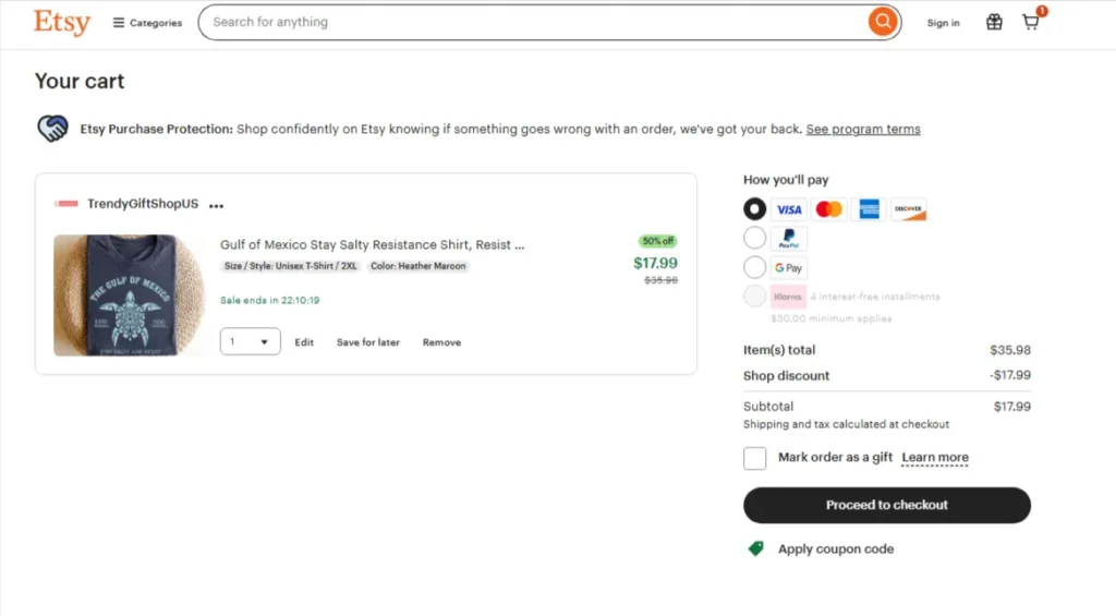
Etsy: Smart Checkout Flow with Clear Steps
Etsy does a great job of making checkout feel simple. When you add something to your cart, you’re not rushed. The cart works like a “pre-checkout,” giving you time to review and choose how you want to pay. Depending on your choice, like PayPal, Apple Pay, or pay-later options. Etsy sends you through a checkout flow that fits your method.
Once you enter the main checkout process, a few smart design choices stand out:
A security badge is shown clearly.
A progress bar at the top tells you what step you’re on.
Form fields are easy to fill out and clearly labeled.
This helps reduce confusion and keeps the process moving smoothly.
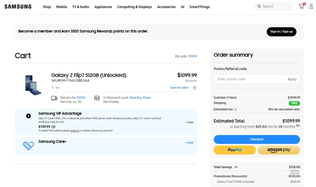
Samsung: Focused, Step-by-Step Checkout
Samsung takes a different approach. Instead of showing you all the fields at once, it only shows what’s needed at the moment.
For example:
You won’t see billing address fields until you pick a payment method.
If you choose an express checkout option, many fields disappear completely.
This keeps the screen clean and focused. You only make one decision at a time.
Samsung also assumes you want to check out as a guest. If you’d like to log in, that option is still there, but it’s not forced. This makes checkout fast and stress-free. Cart details, taxes, and shipping info are all shown clearly. And if you have a question, there’s a “Chat with an expert” button right on the page. That adds trust and support when it’s needed most.
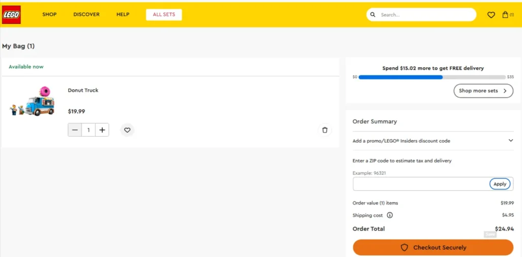
LEGO: Simple and Fast Two-Step Checkout
LEGO keeps it super straightforward. After clicking “Checkout Securely,” you’re taken through just two quick steps: shipping and payment. There’s no clutter, and you don’t need to do extra clicks.
LEGO also offers guest checkout, which helps reduce friction. You don’t have to sign up for an account to buy your favorite LEGO set. This design is built for ease. It respects your time and makes the process feel quick and smooth.
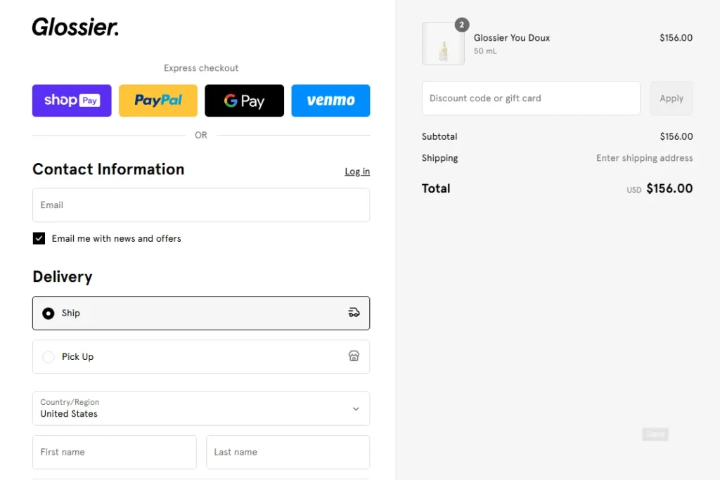
Glossier: Clean Design with Smart Navigation
Glossier keeps its checkout process sleek and simple. It uses a multi-page layout, but everything is easy to follow.
Here’s what works well:
Clear options to log in or check out as a guest.
A clean, minimal design that avoids distractions.
Easy links to go back to your cart or continue to shipping.
These little details help you stay in control without losing your place. Plus, Glossier adds a small surprise, a free gift during checkout. This little bonus encourages customers to finish their purchase and adds a feel-good moment to the process.
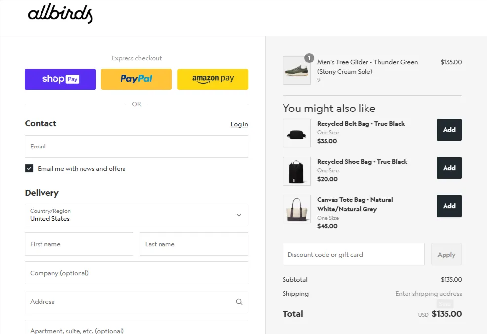
Allbirds: Clean, Distraction-Free Checkout
Allbirds uses Shopify’s checkout system, and it’s a great example of how simple can be powerful. The design is stripped down. There’s no menu, header, or footer. Just the checkout form.
Here’s why it works:
It offers alternative payment options right at the top, like Shop Pay or PayPal.
The coupon field is greyed out until you type something in. This helps avoid confusion or distraction.
The whole process feels clean, fast, and modern.
It’s built to get you from cart to confirmation with as little friction as possible.
In short, top brands like Etsy, Samsung, LEGO, Glossier, and Allbirds show how clean layouts, guest checkout, smart progress tracking, and clear payment options can create a smooth and stress-free checkout experience. Their designs focus on reducing friction, building trust, and guiding users step by step to complete their purchase with ease.
Benefits of Having a Good eCommerce Checkout Page Design
A good checkout page delivers results. When done right, it creates a smooth path for your customer to complete their order. That leads to better conversions, more trust, and fewer lost sales. Here are the key benefits of a well-designed eCommerce checkout page:
Fewer Abandoned Carts: Many customers leave during checkout because of a poor experience. Hidden fees, confusing layouts, or too many steps can drive them away. A good design fixes that. It keeps things simple and clear, so more people finish what they started.
Higher Conversion Rates: When checkout feels easy, people are more likely to buy. A clean layout, guest checkout, and clear pricing help remove friction. This results in more completed purchases and more revenue.
Improved Trust and Confidence: A secure and well-organized checkout builds trust. Features like payment badges, progress bars, and clear forms make customers feel safe. When shoppers trust your site, they feel more comfortable entering payment details.
Better Mobile Experience: A good checkout design works smoothly on phones too. With more people shopping on mobile, this matters a lot. Large buttons, auto-fill, and simple steps make it easy to buy, even on a small screen.
Faster Checkout Process: Time matters. A well-designed page helps users check out quickly. It requires less typing and less confusion. Speed keeps customers happy, and they keep coming back.
Lower Customer Support Load: If the checkout is confusing, people reach out with questions. A clear design means fewer issues and fewer support requests. That saves time for both your team and your customers.
Stronger Brand Image: Good design reflects well on your brand. A smooth, secure, and easy checkout experience makes your store look professional. It shows that you care about your customers and their time.
In short, a great checkout page helps people buy with confidence. It removes the small barriers that cause big problems. And when you make checkout easy, your business grows.
Best Practices for Designing Checkout Pages in eCommerce
A great design is only the start. To truly improve your checkout experience, you need to think beyond the basics. Here are the best practices smart eCommerce brands follow to make checkout more effective.
Keep Checkout Distraction-Free: The moment a customer enters the checkout, their focus should be on completing the purchase. Remove anything that takes their attention away, like menus, popups, banners, or unnecessary links. Clean design improves focus and lowers drop-off rates.
Use Smart Defaults and Predictive Inputs: Good design saves time. Use smart defaults like auto-selecting a customer’s country based on location. Use address lookup tools and auto-fill where possible. The less typing, the better.
Prioritize Page Speed: Slow checkout pages kill conversions. Compress images, use lightweight code, and avoid loading unnecessary scripts during checkout. Every second counts, especially on mobile.
Handle Errors Gracefully: Mistakes happen. But they shouldn’t frustrate your customers. Use inline error messages (not popups). Highlight the exact field with the issue and explain clearly how to fix it. Never reset the form when there’s an error. That’s an easy way to lose a sale.
Use Clear, Action-Oriented CTAs: Your call-to-action buttons (like “Continue to Payment” or “Place Order”) should stand out visually. Use simple, action-based language. Avoid generic terms like “Next.” Be clear about what the button will do.
Reinforce Value at the Final Step: Remind customers of what they’re getting just before they pay. It could be “Free shipping,” “30-day returns,” or a special offer. A small confidence boost at the right moment can help them complete the purchase.
Display Contact or Help Options Clearly: Customers might have last-minute questions. Make sure help is easily available, whether that’s live chat, a phone number, or a clear FAQ link. This builds trust and reduces hesitation.
Use Exit-Intent or Cart Recovery Tactics Wisely: If someone’s about to leave the checkout, consider offering a small incentive, like free shipping or a discount. Just be careful not to annoy them with too many pop-ups. You can also follow up later with cart recovery emails.
Keep Testing and Optimizing: Your first version is rarely your best. Use A/B testing to see what changes improve conversion rates. Test things like button text, field layouts, or payment method order. Let data guide your design.
Make the Post-Checkout Experience Just as Smooth: Don’t stop after “Place Order.” Show a clear confirmation page. Send a helpful follow-up email. Keep customers informed about their order. A smooth end-to-end experience builds loyalty and leads to repeat purchases.
In short, smart checkout design goes beyond looks. It’s about speed, clarity, and removing friction. From clean layouts to helpful CTAs and ongoing testing, every detail helps customers buy with less effort and more confidence.
Summing Up
Having a good eCommerce checkout page design is a key part of your eCommerce success. When done right, it removes friction, builds trust, and helps more customers complete their purchase.
From offering guest checkout to showing clear pricing and using smart design choices, every small detail matters. Brands like Etsy and Samsung show that improving checkout isn’t just about looks; it’s about making the process easier, faster, and more reliable for your shoppers. If you want better conversions and fewer abandoned carts, your checkout page design should be on point. And if you want experts to work on the checkout page and other parts of your eCommerce stores, you can get in touch with us today!
FAQs on eCommerce Checkout Page Design
Q1. How often should I update my checkout page design?
You don’t need to redesign it often, but it’s smart to review it every few months. Look at what’s working and what’s causing drop-offs, and test small changes. Trends and customer behavior can shift fast, so stay flexible.
Q2. Do I need a developer to improve my checkout page?
Not always. Many platforms like Shopify or WooCommerce offer apps and built-in tools to help you customize checkout without coding. But if you want more control or advanced features, a developer can help fine-tune the experience.
Q3. Should I use upsells or cross-sells during checkout?
It depends on how you present them. If they’re subtle and don’t interrupt the process, they can work well. But avoid cluttering the page or making checkout feel like a sales pitch. Keep the focus on completing the purchase first.
Q4. Is single-page checkout better than multi-page checkout?
It depends on your audience and product. Single-page checkouts are faster, but multi-page flows can feel more organized. The best option is the one that makes it easiest for your customers to complete the process.
Q5. What is the checkout flow for eCommerce?
The checkout flow is the step-by-step process a customer follows to complete a purchase. It usually includes entering shipping details, selecting a payment method, and confirming the order. A smooth flow keeps buyers from dropping off.
Q6. Does Shopify have a checkout system?
Yes, Shopify has a built-in checkout system that’s fast, secure, and mobile-friendly. It supports multiple payment methods and can be customized to fit your brand. Many top brands use it because it’s simple and effective.
Priyanka is a highly vetted expert who seamlessly blends the worlds of Marketing and UI/UX. Specializing across diverse industry domains, her unique strength lies in her deep understanding of human psychology. This insightful grasp allows her to craft marketing strategies and design user experiences that are not only aesthetically pleasing and functional but are also precisely tailored to influence user behavior and drive meaningful engagement.
At BrainSpate, we recognize the power of standing out from the crowd in an effort to get more customers and product admirers. For that, you can have a consultation with us and get a free quote.