Developing a Shopify app is one thing, but developing one that doesn’t look like a cluttered afterthought is another. We’ve all seen (or used) apps that feel like they’re fighting against the Shopify Admin, leaving merchants confused and, eventually, uninstalling them.
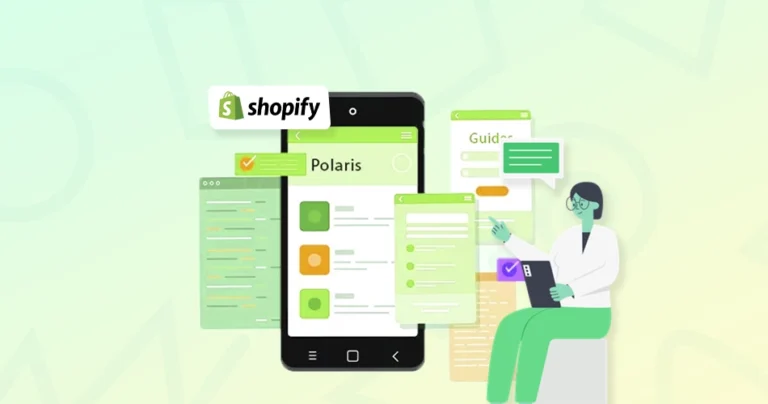
Shopify Polaris is designed to solve these issues. It is a UI kit that provides the same building blocks, including layouts, buttons, and patterns, that Shopify’s in-house team uses. By following these guidelines, you develop a user-friendly app that feels trustworthy. When your app feels like a natural extension of the merchant’s dashboard, getting used to it is easy.
In this guide, we’re discussing how Polaris actually works, what its main components are, and more. Let’s dive in!
What is Shopify Polaris?
Shopify Polaris is a design system from Shopify that helps developers build apps with a consistent, user-friendly interface. It isn’t just a UI library; it’s a full toolkit that includes components, design guidelines, content standards, and accessibility principles.
With Polaris, your app can look and behave as if it belongs in Shopify, making it more intuitive for merchants.
What Does Shopify Polaris Include?
Shopify Polaris offers a wide range of components that help you create a consistent, user-friendly experience across your app. These components follow Shopify’s design guidelines and are built to handle everything from layout and navigation to forms and feedback. Here’s a quick look at the core components included in Shopify Polaris:
1. React Component Library
A collection of pre-built UI elements like buttons, cards, modals, and forms designed specifically for Shopify apps.
Example: A simple Polaris Card component
import { Card } from '@shopify/polaris';

<Card title="Store Info" sectioned>

  <p>This is a basic card using Polaris components.</p>

</Card>
Each component is responsive, accessible, and consistent with Shopify’s visual identity.
2. Design Tokens & Theming
Polaris uses design tokens for colors, spacing, typography, and more, making it easy to customize your app’s look while staying aligned with Shopify’s branding.
Tokens such as –p-color-text, –p-space-500, or theming props in AppProvider help control your app’s style globally.
3. Layout & UX Guidelines
Polaris provides layout components such as Page, Layout, and Stack to help you build structured and responsive UIs effortlessly.
It also guides you on spacing, alignment, and grouping so your app feels intuitive without needing a separate design system.
4. Content & Tone Rules
Beyond visuals, Polaris also includes a content system, clear, helpful language tailored to merchants. It promotes writing microcopy that’s friendly, direct, and easy to act on.
For example:
- “Oops! Something broke!”
- “There was a problem saving your changes. Try again.”
5. Built-in Accessibility
Accessibility is at the core of Polaris. Components follow ARIA standards and support keyboard navigation, screen readers, and color contrast best practices, all without extra effort from your side.
Shopify Polaris is more than just a way to build faster; it’s about building smarter. It integrates design, content, and development into a single cohesive system, so your app feels natural to use and is trusted by Shopify merchants.
Why Use Shopify Polaris?
When building a Shopify app, features are not everything. App users should feel comfortable using it on the first click. Shopify Polaris makes a big difference here.
Consistent Shopify UX
With the Shopify Polaris design system, every app follows the same layout, spacing, and behavior as the Shopify admin. This creates a familiar experience for users, so they don’t have to learn your app separately. It feels like a natural part of Shopify, not something external.
Faster App Development
Instead of building the UI from scratch, developers can use ready-made Shopify Polaris components such as forms, buttons, and layouts. This reduces development time and effort, helping launch apps faster without compromising quality.
Built-in Accessibility & Best Practices
Polaris is built with strong standards in mind. It follows accessibility rules such as proper contrast, keyboard support, and screen-reader compatibility. It also includes clear Shopify design guidelines, so apps are not only usable but also inclusive for all users.
Improved User Experience
Polaris’s structured and tested approach makes it easier to navigate and understand apps. Users can complete tasks faster, with fewer errors and less confusion. This leads to better engagement and higher trust in the app.
Easier Maintenance & Scalability
Using a standard Shopify UI component library means updates are simpler. Changes can be applied across the app without breaking the design. As the app grows, maintaining consistency becomes much easier.
In short, Shopify Polaris lets you skip the design work by using ready-made parts that perfectly match the Shopify dashboard. This makes your app feel familiar to users right away while saving you time on coding, accessibility, and future updates.
Getting Started with Shopify Polaris in React
To start using Shopify Polaris in your React application, you’ll need to set up the library correctly so its components, styling, and language support work seamlessly. The process is simple, but to use it effectively in your React app, you need to set it up correctly from the start.
Step 1: Create a React App
First, you need a React app. If you already have one, you can skip this step. If not, the fastest way to create one is with Create React App (CRA) or Vite. Here’s an example using CRA:
npx create-react-app polaris-demo
cd polaris-demo
This will create a new React project named polaris-demo and move you into the project directory.
Step 2: Install Polaris
Now, you need to add Polaris to your project. Polaris is published as an NPM package, and installing it is straightforward. Run this command:
npm install @shopify/polaris
In addition to UI components, Polaris also uses Shopify’s built-in translation files (i18n), which come bundled with the package. This ensures that UI text, button labels, error messages, and other content are localized correctly.
Step 3: Import Styles & Set Up AppProvider
Here’s where many people encounter minor issues. Polaris components rely on their own styles and must be wrapped in the AppProvider for theming and localization to work. You need to update your main file, typically index.js or App.js. Here’s an example setup:
import '@shopify/polaris/build/esm/styles.css';
import { AppProvider } from '@shopify/polaris';
import enTranslations from '@shopify/polaris/locales/en.json';
import Home from './Home';
function App() {
  return (
    <AppProvider i18n={enTranslations}>
      <Home />
    </AppProvider>
  );
}
Explanation:
- AppProvider is a context provider from Polaris. It handles theming, translations, and configuration needed for Polaris components to render properly.
- The i18n prop passes in Shopify’s English translation file. Without this, Polaris components will show empty text or fail to render properly.
- The Polaris CSS file is essential. If you forget to import it, your components will look unstyled or broken.
Setting up Polaris is a one-time step that lays the foundation for everything else. Once done, you can start building your Shopify-native interface with polished, ready-to-use components. But of course, it can be a challenge for those without the technical skills. So hire Shopify store developers with expertise in custom native development.
Shopify Polaris Components Overview
To build a smooth, easy-to-use Shopify app, it’s important to understand its building blocks. The Shopify Polaris components are those building blocks. They are ready-made UI elements that help create clean and consistent interfaces without starting from scratch.
Navigation Components
These components help users move around the app easily. They include tabs, links, pagination, and menus. Proper navigation enables users to quickly locate what they need without getting lost. This is a key part of effective Shopify admin UI design.
Data Display Components
These are used to present information clearly. Examples include tables, lists, badges, and cards. They help organize large amounts of data so users can read and understand it quickly, even on smaller screens, thanks to Polaris’ responsive design.
Forms & Input Components
Forms are where users add or update data. Polaris provides ready-to-use inputs like text fields, dropdowns, checkboxes, and date pickers. These follow Shopify Polaris accessibility guidelines, making them easy to use for everyone, including users with disabilities.
Feedback Indicators
These components show what’s happening in the app. They include banners, alerts, loading spinners, and status badges. They guide users by providing clear signals, such as success messages or error warnings, which improve overall trust and usability.
Together, these components form a strong Shopify UI component library. They make it easier to build apps that look professional, work smoothly, and follow the Shopify Polaris design system without extra effort.
Design and user input are two of the most interactive aspects of a Shopify app. Polaris makes both easy to manage; it gives you full control over theming via design tokens and offers form components with built-in validation. This section explains how to personalize your app’s visuals and collect user input effectively.
Theming with Design Tokens
Polaris uses design tokens to help you control colors, spacing, and typography across your app. You can define themes directly in AppProvider using a theme prop.
Example: Customizing the top bar color
<AppProvider
  i18n={enTranslations}
  theme={{
    colors: {
      topBar: {
        background: '#004c3f',
      },
    },
  }}
>
  <YourApp />
</AppProvider>
Explanation:
- This snippet changes the top bar’s background color.
- You can theme other elements like buttons, text, or borders using Polaris token keys.
Theming ensures your app remains visually consistent while allowing subtle brand customization.
Building Forms & Validations
Polaris makes it easy to build accessible forms using components like FormLayout, TextField, Select, and Checkbox. These are responsive by default and support validation out of the box.
Example: Email input with validation
<FormLayout>
  <TextField
    label="Email"
    value={email}
    onChange={handleEmailChange}
    error={!isValidEmail ? 'Enter a valid email' : ''}
  />
</FormLayout>
Add a success toast on submission:
{toastActive && (
  <Toast content="Form submitted successfully!" onDismiss={toggleToast} />
)}
Explanation:
- error shows validation messages.
- Toast provides feedback after form actions, such as save or submit.
Together, theming and form handling in Polaris give your app a polished, user-friendly edge. You can guide users through clean interfaces while staying visually consistent with Shopify’s ecosystem.
Responsive Design & Embedding with Shopify Polaris
When building apps for Shopify, your UI should not only look great on all screen sizes but also feel embedded within the Shopify admin dashboard. Polaris provides responsive layout tools, and when combined with Shopify App Bridge, your app behaves like a native part of Shopify. This section shows how to handle both layout flexibility and app embedding effectively.
Responsive Layouts with Polaris
Polaris components are built to be mobile-first and adjust automatically to different screen sizes. Layout helpers like Page, Layout, Section, and Stack make this process easier.
Example: Responsive UI using Layout and Stack
<Page title="Orders">
  <Layout>
    <Layout.Section>
      <Card title="Overview" sectioned>
        <p>This section scales well on all devices.</p>
      </Card>
    </Layout.Section>
    <Layout.Section secondary>
      <Stack wrap={false} alignment="center">
        <Button>Primary</Button>
        <Button>Secondary</Button>
      </Stack>
    </Layout.Section>
  </Layout>
</Page>
Explanation:
- Layout.Section divides content into adaptive blocks.
- Stack handles flexible horizontal or vertical arrangements with responsive spacing.
Embedding Your App with Shopify App Bridge
If you’re building an embedded app inside the Shopify Admin, you’ll need Shopify App Bridge. It enables your app to communicate securely with Shopify and handles navigation, modals, and permissions.
Basic Setup with Polaris + App Bridge:
import { AppProvider } from '@shopify/polaris';
import { Provider } from '@shopify/app-bridge-react';
import enTranslations from '@shopify/polaris/locales/en.json';
const appBridgeConfig = {
  apiKey: 'your-api-key',
  shopOrigin: 'your-shop.myshopify.com',
  forceRedirect: true,
};
<Provider config={appBridgeConfig}>
  <AppProvider i18n={enTranslations}>
    <YourApp />
  </AppProvider>
</Provider>
Explanation:
- Provider from App Bridge wraps your app with a secure context.
- apiKey and shopOrigin are required for authentication and proper redirection inside Shopify.
By combining Polaris layout tools with App Bridge integration, you can create responsive, embedded experiences that look native and behave seamlessly across devices. This ensures a smoother, more professional user experience within the Shopify ecosystem.
Quick Cheat Sheet: Most-Used Shopify Polaris Snippets
When building with Shopify Polaris, you’ll find yourself using certain components again and again. Having these ready-to-use snippets can save time, reduce repetitive work, and help you focus on your app’s logic, not boilerplate code.
Below are some of the most useful and practical Shopify Polaris snippets you’ll likely need in almost every project:
Button with Loading State
Use this when you want to give feedback during a long-running action (save, submit, delete). It shows users that their actions are being processed.
<Button loading={isLoading} onClick={handleClick}>
  Save
</Button>
- loading: Shows a spinner on the button while processing.
- This snippet is great for save/submit actions where feedback is important.
Card with Sections
Cards help you visually group related content. Use them to organize data or create clear sections in your app’s UI.
<Card title="Customer Info" sectioned>
  <p>Display content inside a structured, styled card.</p>
</Card>
- sectioned: Adds default padding and structure.
- Cards are used to group related content.
Page Title with Primary Action
Use this pattern when your page needs a clear “main action”, like adding a product, creating a resource, or starting a process.
<Page
  title="Dashboard"
  primaryAction={{ content: 'Add Product', onAction: handleAddProduct }}
>
  <p>Welcome to your app dashboard.</p>
</Page>
- primaryAction: Adds a CTA button in the top right of the page.
- It’s perfect for defining the main task users can perform.
Form Field with Error
You’ll use this pattern whenever form validation is needed. It automatically displays an error message below the field and applies proper styling.
<TextField
  label="Email"
  value={email}
  onChange={handleChange}
  error={emailError}
/>
- error: Displays a validation message if the input is invalid.
- This snippet automatically handles accessibility and styling.
Toast Notification
Toast is great for lightweight feedback after saving, deleting, or completing an action. It’s non-blocking and auto-dismisses after a few seconds.
{toastActive && (
  <Toast content="Changes saved!" onDismiss={handleDismiss} />
)}
- Use Toast to give feedback after an action (e.g., save/delete).
- This snippet auto-dismisses or can be closed manually.
These snippets are the building blocks for most Shopify apps using Polaris. Having them ready helps keep your UI consistent and your code efficient, so you can focus more on features and less on formatting.
If you want to integrate these snippets and more custom functionalities in your eStore, consult with our Shopify eCommerce development company.
Future of Shopify Polaris & Design Systems
The way Shopify apps are designed is evolving very quickly. Shopify Polaris is becoming a smarter system that helps build better apps with less effort.
Evolution of Shopify Design System
The Shopify Polaris design system continues to improve with better guidelines, updated Polaris design tokens, and more flexible layouts. It is moving towards a system where design and development stay perfectly in sync. This helps teams build apps that look modern and stay consistent as Shopify grows.
Component-Driven Development
Modern app development is shifting towards reusable building blocks. With Polaris React components and a strong Shopify UI component library, developers can create features faster by reusing the same elements across the app. This approach reduces errors and makes scaling much easier over time.
Headless & Polaris Integration
As headless eCommerce becomes more popular, Polaris is also adapting. It works smoothly with custom frontends and supports Shopify App Bridge integration for embedded apps. This means developers can build flexible experiences while still maintaining a familiar Shopify embedded app UI.
More Focus on Developer Experience
Shopify is making it easier to build Shopify apps with Polaris by improving documentation, examples, and tools. Clear Shopify Polaris design system guidelines and better support reduce confusion and help developers move faster without compromising quality.
In short, the evolution of Shopify Polaris aims to make app building faster, cleaner, and more reliable, while keeping the user experience at the center of everything.
Conclusion
When building a Shopify app, features are not everything. Ensuring the app feels easy, familiar, and trustworthy from the first use is critical. Shopify Polaris helps with this. It gives clear design rules, ready UI elements, and a structure that keeps everything clean and consistent. From components and theming to responsive layouts and embedded app setup, Polaris helps create apps that just fit perfectly.
The actual value of the Shopify Polaris design system is in how it simplifies decisions. You don’t have to worry about layout, spacing, or usability every time. Instead, you can focus on solving problems for users. Whether building a new app or improving an existing one, Polaris helps create faster, smoother, and more reliable experiences that users actually enjoy using.
So, are you ready to build a Shopify app that feels truly native and drives results? Get in touch with our team today.
FAQs on Shopify Polaris
1. What is Shopify App Bridge?

Shopify App Bridge is a JavaScript library that helps your app integrate smoothly with the Shopify Admin. It enables features like embedded navigation, modals, toasts, and full-page redirects, making your app feel like a natural part of the Shopify experience. App Bridge works with both React and non-React apps.
2. Is Shopify Polaris open source?
Yes. Shopify Polaris is open source and available on GitHub. This allows developers to contribute, review the code, and adopt Polaris freely in their Shopify app projects. The design system evolves constantly with community and internal contributions.
3. How do I install Polaris on Shopify?
You don’t need to install Polaris on Shopify. Instead, you should install it in your app project. Just run:
Then, wrap your app in Polaris’s AppProvider and import its styles.