B2B websites rarely fail because of design. They fail when they don’t help a visitor make a decision. Most users already arrive with intent, but they still look for clarity before trusting what they see. If the message doesn’t land quickly, attention drops, no matter how clean the layout looks.
Good B2B website design examples work because they follow how the targeted buyers think. They keep information simple, reduce doubt, and make the next step obvious without pressure. It’s less about visual style and more about how easily a page answers quiet questions in the user’s mind.
In this blog, 15 awesome B2B website design examples are discussed for you to take inspiration from. We’ve explored real patterns that drive performance. The focus stays on what works in practice and what can be applied across different types of businesses.
Why Is a Good B2B Website Important?
A B2B website is often the first place where a business is judged. People don’t wait long to form an opinion. Within a few seconds, they decide whether the site looks reliable. That is why design directly affects trust and interest.
First Impressions Matter
Most visitors decide very quickly if they want to stay. Research from Stanford shows that users quickly evaluate a company’s credibility based on its website design. If the page looks confusing or outdated, people lose trust before reading anything. In B2B, that can mean losing a potential client early.
Different People Look for Different Things
B2B buying is rarely done by one person. A finance team checks pricing. A technical person checks specifications. A manager checks whether it solves the problem. All of them visit the same website, but they look for different answers. If the structure is unclear, they leave without finding what they need.
Decisions Take Time, So the Website Does Most of the Work
Most B2B buyers don’t decide quickly. Around 63% take 3 months or more to make a decision. During this time, they keep returning to websites for answers. The site has to explain the product clearly and remove confusion without any support.
Value Needs to be Clear Early
Many buyers expect to see results fast. For example, among businesses investing in AI, about 57% expect a positive ROI within 3 months. Because of this, they look for proof right away. Simple explanations, real examples, and case studies help them understand what they will gain.
Trust Comes from Proof, Not Claims
People don’t rely on claims alone. They look for evidence like case studies, client names, and real results. These details help reduce doubt and make the decision easier.
Speed and Smooth Pages Affect Decisions
A slow or lagging website creates frustration. Even small delays can make users leave. Google’s Core Web Vitals measure how fast and smooth a page feels. A fast site keeps people engaged longer and helps them explore more.
A good B2B website doesn’t try to impress with design alone. It helps people understand, compare, and decide without confusion. So if you’re planning to build a business website with faster performance, smoother buying journeys, and higher conversions, explore our B2B eCommerce development services.
Top 15 B2B Website Design Examples
Good B2B websites don’t try too hard to impress. They focus on clarity, structure, and ease of decision-making for the visitor. The examples below show how strong businesses present information, guide users properly, and build trust without making the experience complicated.
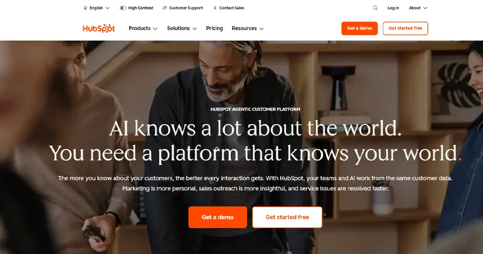
1. HubSpot
HubSpot handles a large platform surprisingly well. The website clearly explains each product without overwhelming visitors. Each page follows a similar structure, so users always know where to look next. One thing worth learning from HubSpot is how smoothly it guides visitors from learning to action without feeling pushy.
Strong use of educational content and free tools.
CTAs stay visible without interrupting the experience.
Product pages are easy to scan and compare.
Customer stories are placed naturally across pages.
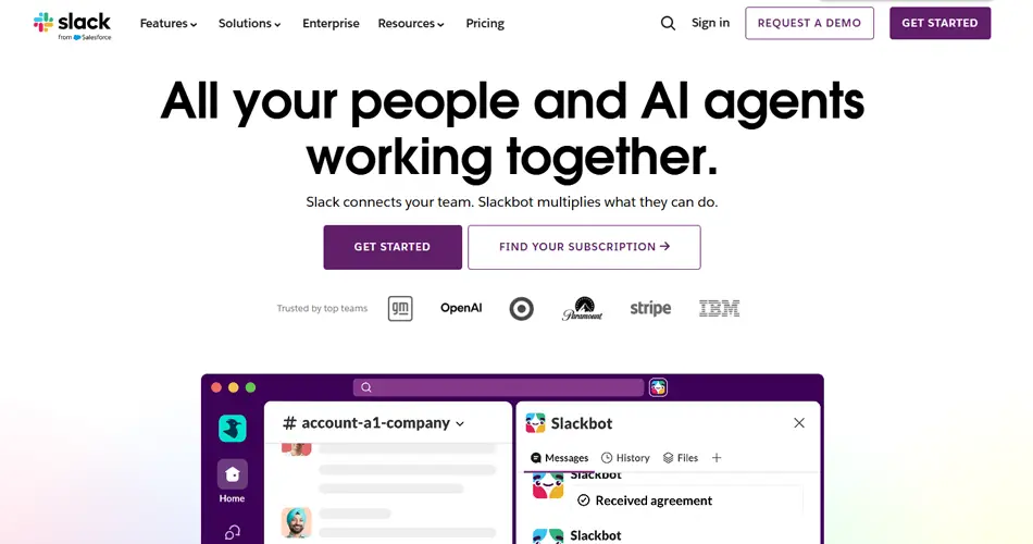
2. Slack
Slack keeps the message very focused from the first screen. Visitors instantly understand that the platform helps teams communicate better. The layout feels clean, the wording is simple, and nothing feels unnecessary. It also balances the needs of small-business users and enterprise buyers very well.
The homepage explains the core value quickly.
Free trial access is easy to find.
Trust signals are visible across the page.
White space keeps the layout breathable.
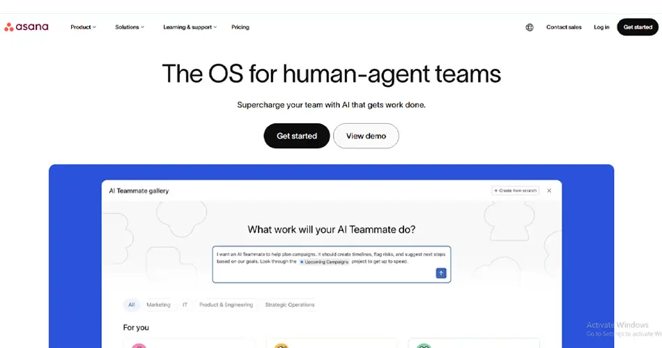
3. Asana
Asana is a strong example of clean structure. The pages never feel crowded, even though the platform offers many features. Visuals explain workflows clearly, and every section quietly pushes users toward the next action. The consistency across pages also makes the experience feel reliable.
Simple navigation with clear categories.
Visual storytelling replaces long explanations.
CTA placement stays consistent.
Mobile experience feels smooth and fast.
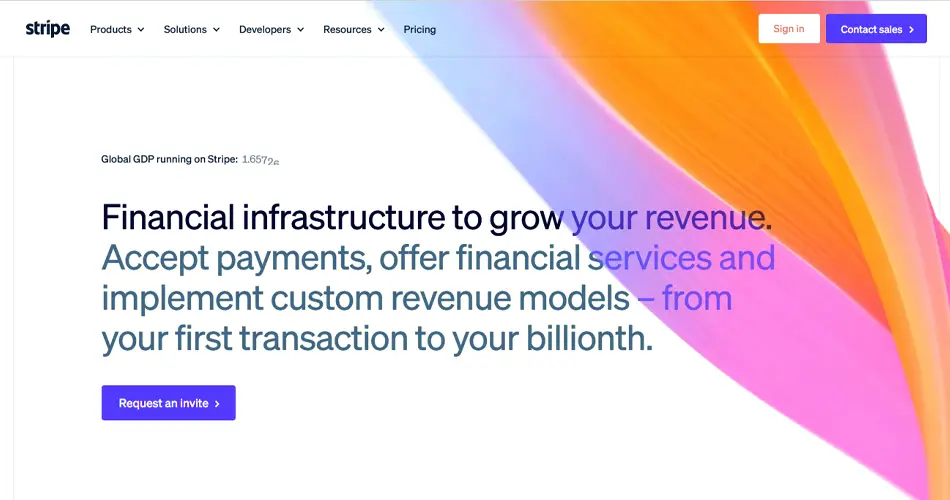
4. Stripe
Stripe handles technical content better than most B2B websites. Developers get detailed documentation, while business users still easily understand the benefits. The design stays minimal, which helps the information stand out. The website also feels extremely fast and responsive.
Documentation is structured very clearly.
Typography improves readability across pages.
Product explanations stay practical and direct.
Strong balance between technical and business content.
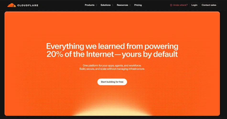
5. Cloudflare
Cloudflare builds trust through clarity. Security, reliability, and technical depth appear naturally throughout the website. Even with large amounts of information, the pages still feel organized. The design supports both technical users and business decision-makers without confusion.
Security-related content is easy to access.
Navigation handles large content well.
Technical pages stay clean and readable.
Strong trust-focused messaging throughout.
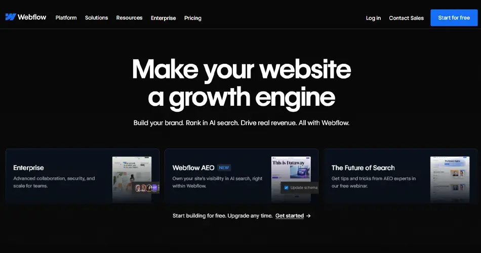
6. Webflow
Webflow understands that different users visit with different goals. Designers, marketers, and developers are all guided properly from the homepage itself. The design feels modern without becoming distracting. Motion and animations are used carefully instead of excessively.
Smart audience segmentation across pages.
Minimal layouts keep focus on the product.
Strong visual consistency sitewide.
Good example of modern b2b website design examples.
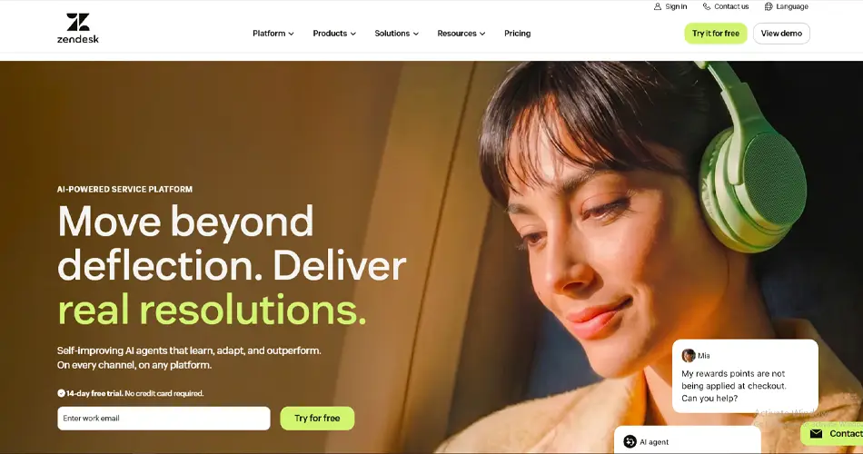
7. Zendesk
Zendesk simplifies a broad platform through smart organization. Instead of using technical product names everywhere, the site focuses on customer problems and solutions. That makes the experience easier for first-time visitors. The structure also helps users find answers quickly.
Navigation uses customer-friendly language.
Support content is easy to discover.
Page layouts stay clean and balanced.
Product categories are grouped clearly.
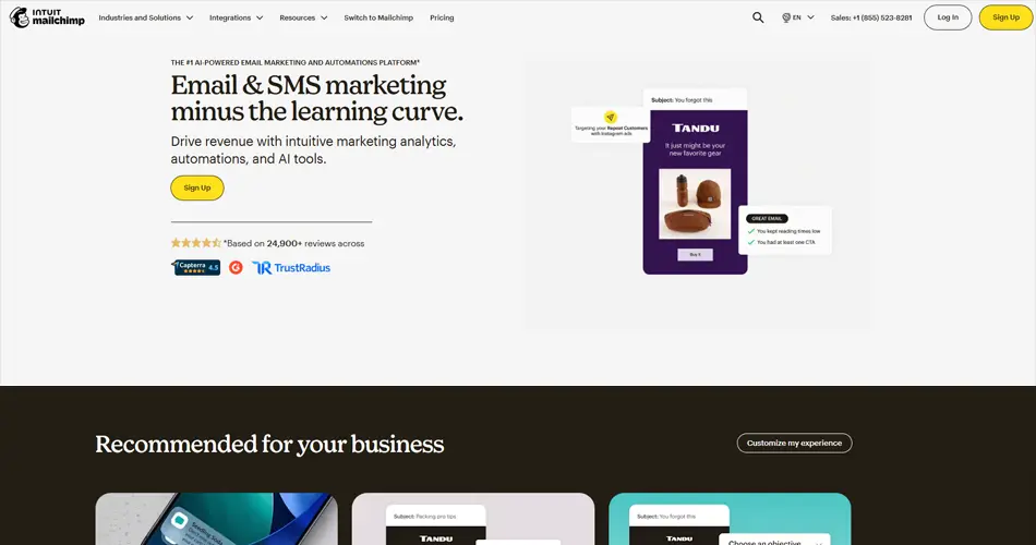
8. Mailchimp
Mailchimp mixes personality with simplicity very well. Pricing, features, and tools are explained in an approachable way, especially for smaller businesses. The website looks creative yet remains organized. It also does a good job of reducing confusion during signup.
Pricing information is easy to compare.
Illustrations make pages feel lighter.
Onboarding flow feels smooth.
Resource sections help build trust.
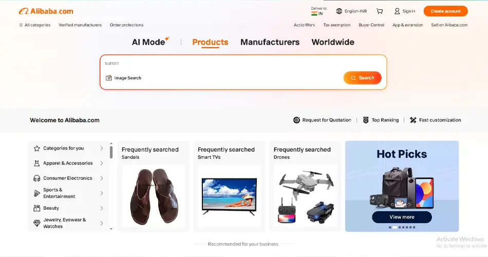
9. Alibaba
Alibaba manages large volumes of product and supplier data without making the experience messy. Filters, categories, and product pages all work together smoothly. Despite the platform’s scale, users can still navigate the site comfortably. It is a strong example of eCommerce website design for small-business marketplaces that are growing into enterprise platforms.
The product filtering system works very well.
Supplier details are clearly structured.
Search experience feels fast and accurate.
Trust badges appear throughout the platform.
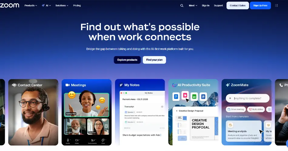
10. Zoom
Zoom keeps everything straightforward. The homepage quickly explains the product, and users immediately know where to go next. There are very few distractions, which helps maintain focus. The simplicity also makes the platform feel easier to trust.
Clear homepage messaging.
Product sections stay short and focused.
Navigation feels simple and fast.
Signup journey is easy to follow.
11. Square
Square speaks directly to business owners who want to grow. The messaging feels practical instead of overly technical. Product categories are separated properly, helping users find the right solution without effort. The website also performs well across mobile devices.
Strong business-focused messaging.
Service pages are well-organized.
Mobile layouts feel smooth.
Checkout and signup flows reduce friction.
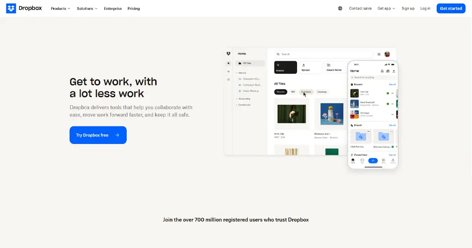
12. Dropbox
Dropbox proves that simple design still works. The website focuses only on key actions like storing, sharing, and syncing files. Nothing feels unnecessary. That simplicity helps users understand the value almost immediately.
Minimal layout keeps attention focused.
Fast-loading pages improve usability.
Feature explanations stay short and clear.
Signup process feels effortless.
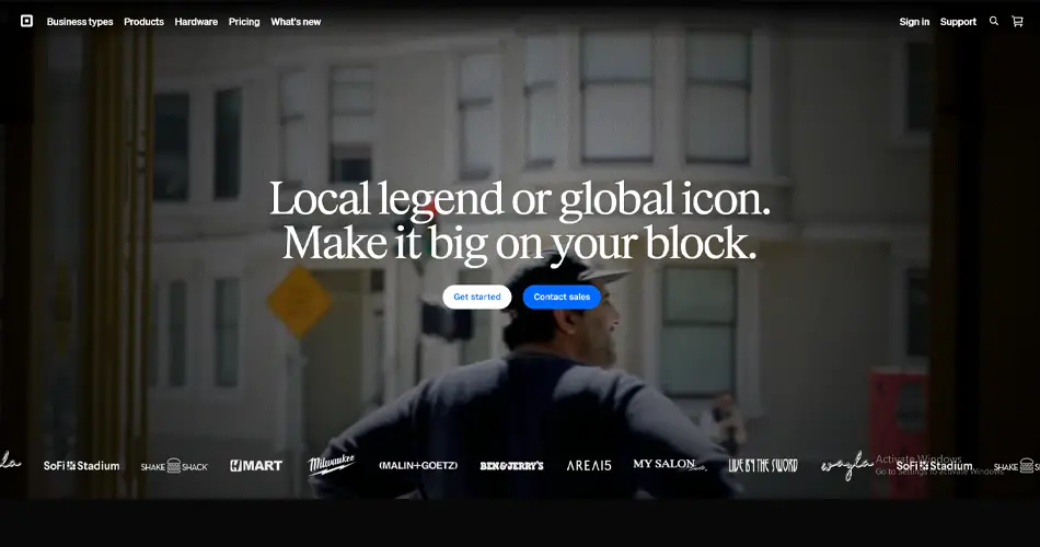
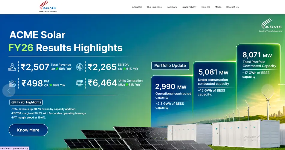
13. Acme
Acme takes a practical approach that fits its industry perfectly. The website focuses more on function than flashy visuals. Product information is easy to access, and users can quickly move toward quotes or specifications. The design respects the buyer’s time.
Product specs are easy to locate.
Navigation stays straightforward.
Clear quote request buttons.
Industrial visuals match the audience well.
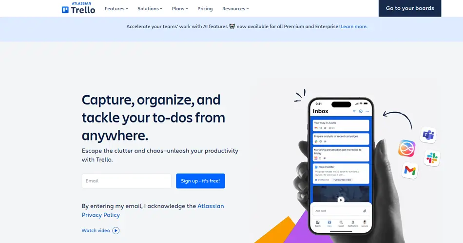
14. Trello
Trello explains its collaboration tools using visuals rather than dense text. The platform feels approachable even for first-time users. Every section focuses on simplicity, which helps users understand workflows faster. The overall experience feels light and easy to follow.
Visual feature explanations improve clarity.
Color usage keeps pages engaging.
Navigation feels natural and smooth.
Mobile layouts stay user-friendly.
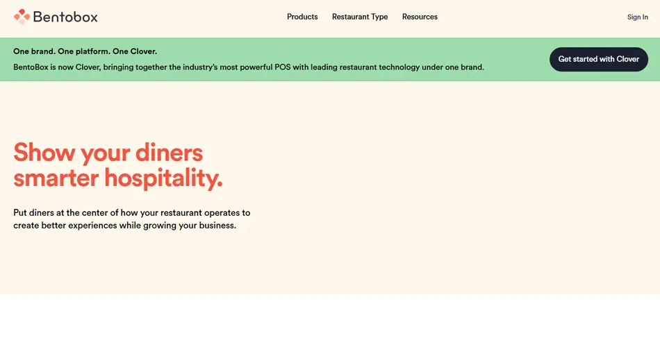
15. Bentobox
Bentobox understands its audience very well. The website speaks directly to restaurant owners using practical language and real examples. Testimonials and customer stories are placed naturally throughout the site, helping build trust without overdoing it.
Strong use of social proof.
Demo requests are easy to find.
Industry-focused messaging feels relevant.
Conversion paths stay clean and simple.
The best B2B websites make complicated services feel easy to understand. Strong structure, simple messaging, and clear navigation are what separate high-performing websites from average ones. Planning to create clear user journeys for more trust and better conversion performance? Opt for our B2B eCommerce website design services.
What These Best B2B Websites Have in Common
Most strong B2B websites follow the same basics. They make information easy to understand, clearly guide users, and remove unnecessary confusion from the buying process.
Clear Messaging: Good websites explain the business quickly. Visitors should understand the service within a few seconds, without having to scroll too much.
Easy Navigation: Menus and page structure feel simple. Users can easily find pricing, services, features, or contact pages without searching around.
Clean and Readable Layouts: The best websites avoid clutter. They use spacing, short sections, and clear headings to make reading easier on both desktop and mobile.
Trust-Building Elements Throughout the Site: Client logos, testimonials, reviews, and case studies appear naturally across pages. These small details help visitors feel more confident.
Clear Next Steps: Visitors always know what to do next. Demo buttons, contact forms, pricing links, or free trials are easy to spot without feeling forced.
Fast and Smooth Experience: Pages load quickly and feel responsive. Slow websites usually lose visitors before they even explore properly.
Consistent Design Across Pages: Fonts, colors, buttons, and layouts stay consistent across the website. That consistency makes the brand feel more reliable.
Simple Language: The best B2B websites avoid complicated wording. Even technical services are explained in a way that feels easy to follow.
For a deeper breakdown of structure, flow, and usability principles, consider looking for eCommerce design tips that directly influence how users interact with B2B websites.
Most b2b website design examples succeed because they keep things simple. Clear structure, smooth navigation, and strong trust signals are usually what separate good websites from forgettable ones.
Conclusion
Good B2B websites make things easy for the visitor. They explain the service clearly, guide users properly, and remove confusion from the buying process. The strongest b2b website design examples focus on clear messaging, easy navigation, fast load times, and trust-building content rather than unnecessary design effects.
Every website covered in the blog follows the same basics. Users quickly understand what the business offers, where to go next, and why the company feels reliable. Strong structure, clean layouts, and a smooth user experience are the signs of a high-performing, credible B2B website.
FAQs on B2B Website Design Examples
1. What makes a B2B website design effective for lead generation?
An effective B2B website makes information easy to find and easy to trust. Clear messaging, simple navigation, strong case studies, and visible CTAs help visitors move toward demos or contact forms faster. Fast loading speed and mobile responsiveness also significantly improve conversions.
2. How is B2B website design different from B2C website design?
B2B websites focus more on trust, detailed information, and longer decision-making journeys. Buyers usually compare solutions, pricing, technical details, and ROI before taking action. B2C websites are often more emotion-driven and built for faster purchases.
3. How to display complex technical products on a B2B website?
Complex products should be broken into smaller, easy-to-understand sections. Use visuals, short explanations, comparison tables, and real use cases instead of long technical paragraphs. Good structure helps both technical and non-technical buyers understand the product faster.